Showing posts with label usability. Show all posts

Monday, 23 March 2020

Extraordinary times

Two weeks ago (Monday 9th March), I stood at the front of a class and said "In the unlikely event that UCL closes before the end of term..." and within a week all face-to-face teaching had been cancelled. Such is the experience of exponential change. I know I'm not alone in realising that views I held a matter of days ago were untenable. I am guessing that this process of revising beliefs and attitudes isn't over yet.

The last day I was in the office was just two days after that wildly incorrect assessment. I'd planned to work at home the end of that week anyway. Since I work at home quite often I was already set up for most things, but there were a few items I hadn't brought home. The most critical turned out to be my interoperable collection of "so 1990s" Filofaxes. I ordered one. I've lost continuity in my note taking, but by asking all my team to remind me what we'd agreed in our previous meetings I'm catching up quickly. Home delivery worked brilliantly too.

Improvised desks are sprouting up in our house, such as a standing desk made up of an old bookshelf with a small "laptop desk" which is located right next to the wifi router for use during the more critical online meetings.

I had to do a rapid rethink on all my teaching: lectures got recorded ahead of time so that I wasn't totally reliant on our home broadband at the critical time (that worked easily once I'd mastered the uploading software for the virtual learning environment). Class quizzes worked well remotely. Class discussion with over 30 students was challenging. When I had a smaller class a few days later, I mercilessly brought each student into the discussion, keeping a list of who had contributed and who hadn't yet. Not as good as face-to-face, but not bad either.

This coming week, I'd have liked to do a discussion exercise with digital postits in class. I considered several alternative tools for this; some required too much set-up for a single session; some work better asynchronously than in real time; I've ended up just sharing an online document that all students can contribute to, and we'll see whether we can build a discussion around that. It's all a bit of an adventure.

Many of our MSc students are having to rethink their projects for this summer because we have to assume they won't be able to travel or to do any collocated data collection. That's yet another challenge. But at least we can all access library resources from our homes because of all the work that has been done to make them remotely accessible.

I seem to be spending most working hours in online meetings. Many of these work as well as traditional meetings. More importantly, we're using the same videoconferencing technologies for social events: for sitting around in the evenings with friends and family – not just one-to-one like phone calls, but collecting in groups, socially close while physically distant.

None of this would have been possible, even a few years ago. Even if the foundations of the Internet were established in the 1960s and the early World Wide Web around 1990, the tools that we're now using on top of these structures have all been developed within the past few years. And they are getting easier to use and to fit into our lives very rapidly.

If SARS-COV2 had emerged three years ago, I don't know how we would have dealt with ageing parents who believed that they could live independently but actually needed a lot of support (to which they were unrelentingly hostile). Since then, my father has died and my mother is now in a care home, living with advanced dementia. I wouldn't want to visit (even if permitted) for fear of passing on COVID-19 to the wonderful residents or staff. So last week we tried using FaceTime to chat (with support from Jo the manager). I wasn't hopeful that Mum would engage at all, but she seemed to recognise me (at least as a close female relative, if not necessarily as her daughter). We had a good few minutes' surreal chat interspersed with Mum singing then, as I made to say goodbye, she leant forward and kissed the phone. It was strange, and yet poignantly lovely to have this kind of connection when we can't be together. Even if both the phone and Mum's lips then needed a clean!

On Friday, we had a take-away. It seems important to support our local restaurants as they are forced to close and take-aways are the only option. I wonder whether it will continue to be a safe option at all in the coming weeks.

Schools closed on Friday (20th March), which is going to add to the stresses of our children continuing to work while also home schooling. Family have been recruited as remote teachers. Granny will be doing reading and writing; Grandad is starting with some "horrible history"; Auntie will be teaching French; and I'm concocting some science lessons. If we thought remote teaching of students was challenging, remote teaching of small boys ia likely to be substantially more so, but at least it will mean regular contact, and we'll all learn something new in the process.

There are also lots of online classes sprouting up: I'm looking forward to yoga and zumba this week even if they will require us to reorganise furniture even more (in addition to the improvised desks) to make space to move.

We know we are really lucky: we can work fairly effectively from home and we have a garden for fresh air. Mum is safe and well looked after; the rest of the family are all well so far, even if the youngsters are restless. We are aware that many other people have much greater challenges and stresses and grief to deal with. I am truly grateful to all key workers: in healthcare and in keeping essential services (including food, medication and internet provision!) available.

Footnote: Week 2 was still a period of adjustment...

Sunday, 4 March 2018

How not to design the user experience: update 2018

In November 2014, I wrote a summary of my experience of entering research data in Researchfish. Since then, aspects of this system have improved: at least some of the most obvious bugs have been ironed out, and being able to link data from ORCID makes one tedious aspect of the task (entering data about particular publications) significantly easier. So well done to the ResearchFish team on fixing those problems. It's a pity it's still not fit for purpose, despite the number of funders who are supporting (mandating) use of this system.

The system is still designed without any consideration of how people conceptualise their research outputs – or at least, not how I do. According to ResearchFish, it takes less than a lunchbreak to enter all the data. There are two problems with this:
1. Few academics that I know have the time to take a lunch break.
2. So far, today, it has taken me longer than that just to work out a strategy for completing this multi-dimensional task systematically. It's like 3-D Sudoku, but less fun.

Even for publications, it's a two-dimensional task: select publications (e.g., from ORCID) and select grants to which they apply. But if you just do this as stated, then you get many-to-many relationships, with every publication assigned to grants that it isn't associated with as well as one(s) it is. And yes, I have tested this. So you have to decide which grant you're going to focus on, then go through the list and add those... then go around the loop (add new publications > select ORCID > search > select publications > select grant) repeatedly for all grants. Maybe there's a faster way to do it, but I haven't discovered that yet. Oh: and if you make a mistake, there isn't an easy way to correct it, so there is probably over-reporting as well as under-reporting on many grants.
I'm still trying to guess what "author not available" means in the information about a publication. My strategy for working out which paper each line refers to has been to keep Google Scholar open in parallel and search for the titles there, because those make more sense to me.

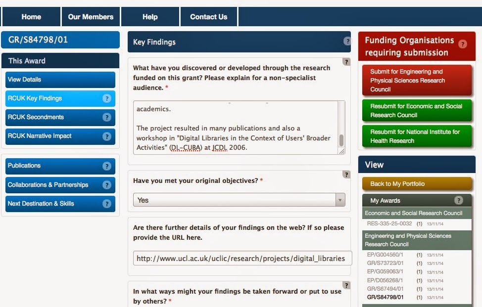
In the section on reporting key findings of a grant, when you save the entry, it returns you to the same page. Why would you want to save multiple times, rather than just moving on to the next step? Why isn't there a 'next' option? And why, when you have said there is no update on a completed grant, does it still take you to the update page? What was the point of the question?

When you're within the context of one award, and you select publications, it shows all publications for all awards (until you explicit select the option to focus on this award). Why? I'm in a particular task context...

When you're in the context of an award where you are simply a team member, you can filter by publications you've added, or by publications linked to this award, but not by publications that you've added that are also linked to this award. Those are the ones that I know about, and the ones that I want to check / update.

Having taken a coffee break, I returned to the interface to discover I had been logged out. I don't actually know my login details because the first time I logged in this morning I did so via ORCID. That option isn't available on the login page that appears after time-out. This is further evidence of poor system testing and non-existent user testing.

I could go on, but life is too short. There is no evidence of the developers having considered either conceptual design or task structures. There is no evidence that the system has actually been tested by real users who have real data entry tasks and time constraints. I really cannot comprehend how so many funders can mandate the use of a system that is so poorly designed, other than because they have the power to do so.

Friday, 7 April 2017

If the user can’t use it, it doesn’t work: focusing on buying and selling


"If the user can’t use it, it doesn’t work": This phrase, from Susan Dray, was originally addressed at system developers. It presupposes good understanding of who the intended users are and what their capabilities are. But the same applies in sales and procurement.

In hospital (and similar) contexts, this means that procurement processes need to take account of who the intended users of any new technology are. E.g., who are the intended users of new, wireless integrated glucometers or of new infusion pumps that need to have drug libraries installed, maintained... and also be used during routine clinical care? What training will they need? How will the new devices fit into (or disrupt) their workflow? Etc. If any of the intended users can’t use it then the technology doesn’t work.

I have just encountered an analogous situation with some friends. These friends are managing multiple clinical conditions (including Alzheimer’s, depression, the after-effects of a mini-stroke, and type II diabetes) but are nevertheless living life to the full and coping admirably. But recently they were sold a sophisticated “Agility 3” alarm system, comprising a box on the wall with multiple buttons and alerts, a wearable “personal attack alarm”, and two handheld controllers (as well as PIR sensors, a smoke alarm and more). They were persuaded that this would address all their personal safety and home security needs. I don’t know whether the salesperson referred directly or obliquely to any potential physical vulnerability. But actually their main vulnerability was that they no longer have the mental capacity to assess the claims of the salesperson, let alone the capacity to use any technology that is more sophisticated than an on/off switch. If the user can’t use it, it doesn’t work. By this definition, this alarm system doesn’t work. Caveat emptor, but selling a product that is meant to protect people when the net effect is to further expose their vulnerability is crass miss-selling. How ironic!

Tuesday, 22 November 2016

The total customer experience

Last week, I had a delivery from DPD. At one level, it was very mundane (I received and signed for a parcel). At another, it was very positive: I could choose my deliver time to within an hour; I could even elect for a "green" slot when they were going to be in the area anyway (which obviously reduces their cost as well as simplifying my choice). Then on the day I could track the movement of my parcel online and anticipate pretty accurately when it would arrive. The user interface was good, and it was the "front end" of a good system that worked well. This made the overall experience of choosing, ordering and receiving the product much more pleasurable than it might otherwise have been.

In contrast, Samuel Gibbs reports on his experience of using novel Internet of Things tools to do something comparable for frequently bought products. Quite apart from the prospect of having dozens of IoT devices stuck up around the home, he highlights the challenges of receiving the goods once ordered, and of receiving goods in impractically large quantities. These new technologies aren't just about an easy-to-use button-press (like my "easy" button), but about the total customer experience of choosing, ordering and receiving... and someone needs to think that through properly too.

Thursday, 20 October 2016

If the user can't use it, it doesn't work: the invisible costs of bad software

This is a quick rant about unusable enterprise systems and turning visible costs into invisible costs. For an earlier, longer, discussions about different unusable systems, see my reviews of ResearchFish and an electronic healthcare system.

Yesterday, I was one of several people asked to use the Crown Commercial Services system to review some documents related to a bid for one of our public funding bodies. The use of this system is apparently mandated for that organisation.

I was sent instructions on how to do part of the process (which I could not have worked out from the user interface). I followed the instructions provided as far as they were relevant, and I then explored some more to try to locate the documents of the actual bids (which appeared to comprise 28 separate documents for eight bids). Then I tried to download them all in one file. 30 minutes later, the system timed out on me while still processing to create that file. When I logged back in I couldn’t locate the download window again without simply doing all the same actions a second time. And I ran out of time, energy or will to pursue this.

This is yet another example of a system where there is no evidence that the developers ever considered how the system would be used, by whom, under what circumstances, the learning curve to use it first time ... or anything else about the users. Susan Dray has a nice claim: "If the user can't use it, it doesn't work". This is yet another enterprise system that is absolutely not fit for purpose.

What this does is to shift costs from development (investing in making a system that is fit for purpose) to use (forcing every user of the system to waste time trying to achieve their goals despite the system). The former would be a visible cost to the developers and the people who commissioned the system while the latter is an invisible cost borne in all the stress and loss of productivity of the people who have to use the system. For the UK Research Evaluation Framework (REF), these invisible costs were estimated at almost £250 million. That was a one-off exercise; there should be a practice of estimating the annual costs of unusable enterprise systems. I'm pretty confident that the invisible costs would turn out to be significantly greater than the visible costs of creating a system that was fit for purpose in the first place. And we know how to do it. We have known how to do it for decades!

Friday, 4 March 2016

What's in it for me? The challenges of designing interventions for others

"Uninvited guests" is an entertaining short video showing possible, compelling, responses to well-meaning digital interventions for wellbeing that an elderly relative is encouraged to use.

Recently, a friend (I'll call her Hanna) told me about her experience of something similar, and it highlighted to me just how challenging it is to design well to help others to live well, and how important it is to make new designs of direct value, and easy to understand.

Hanna's parents are elderly, and had been plagued by nuisance calls: some just irritating, but others that involved mis-selling, "fixing" a computer virus, or otherwise leaving her parents feeling unsettled and cheated. She wanted to work with them to help avoid these calls. They installed Truecall on the line. And for a couple of weeks, it seemed to be working really well: letting through trusted callers while blocking unknown callers. A couple of unrecognised callers contacted her to request access and she extended the list of trusted callers in response. All good!

Then things started to unravel. An elderly acquaintance who wasn't on the list tried calling, did not understand the 'blocking message' immediately, and promptly drove round to her parents' house to ask what was going on. They found this really embarrassing, and it undermined their trust in the system. Hanna worked with her parents to add every known acquaintance to the list of trusted callers. But their fear of missing even one 'real' call had been triggered. At least: that was the surface presentation; I suspect there was more going on.

Apparently, when adding names to the list of trusted callers, Hanna's parents talked about the data entry as if they would then be able to use the list as a phone book. That would have been useful to them. But of course it didn't have that functionality (it's a call blocker, not a call enabler). They had a poor mental model of how Truecall worked and what it did. I'm guessing that this lack of understanding made them feel alienated and disempowered.

Hanna showed her parents their own call log, highlighting all the nuisance calls that had been blocked, and that therefore had not been disruptive. But this was apparently not persuasive at all: they could not remember the occasions where they had been persuaded by mis-selling, and now the concern about missing genuine calls dominated completely. Indeed, Hanna's parents seemed to grow in confidence regarding their ability to manage nuisance calls with every day that passed, and Truecall seemed to become a device that questioned their competence.

They told her about one of their friends also using Truecall. But she tells me she couldn't work out whether this was a positive comment (this is catching on; we're ahead of the curve) or a negative comment (that friend is getting old and having difficulty screening nuisance calls).

At one level, Truecall is a technology that does one job and seems to do it very well. At another level, it is a social device. The fact that them using Truecall was visible to a few of their friends and acquaintances seems to have made it unacceptable, even "embarrassing". I'm guessing it is preferable to them to be autonomous, to feel in control, and not to be seen to be using a call blocker, than to avoid nuisance calls. 
 
We all use technologies that we don’t fully understand. But we need to understand them well enough to feel in control, and it seems as if Truecall went beyond that for these elderly people and their equally elderly friends.

Truecall has had rave reviews, and it really does seem to do its job very well. So it was a surprise to me when Hanna told me about her and her parents' experiences. Maybe, even though I'm pretty sure that Hanna's parents are in the target market segment for Truecall, for something to work for Hanna's parents it would have to be even easier to use, even more transparent. I'm guessing it would have needed the following features:
  • everything accessible without obviously accessing the internet (so, visible on a dedicated display with the phone).
  • offering the 'phone book' capability so that they could more easily make calls.
  • having three call categories that are simultaneously enabled: trusted (come straight through); zapped (blocked, including all withheld numbers); and unknown (with a really easy way to move unknown numbers into trusted or zapped, whether before or after accepting the call).
I'm not sure that this is technically possible at the moment – or if it is, it might be prohibitively expensive to implement. But hopefully it will be possible in the near future. For me, the most important insight is that there are some very subtle emotional and social values that tip a technology from being something to engage with to being something that is rejected. In the uninvited guests video, the star of the show is technology savvy enough to subvert the best of intentions of his family and of the technology design; in Hanna's case, it seems that the only option for her parents was to reject the technology completely. We still have a lot to learn about how to design technology that is truly empowering.

Monday, 31 August 2015

The Digital Doctor


I’ve just finished reading The DigitalDoctor by Robert Wachter. It’s published this year, and gives great insight into the US developments in electronic health records, particularly over the past few years: Meaningful Use and the rise of EPIC. The book manages to steer a great course between being personal (about Wachter’s career and the experiences of people around him) and drawing out general themes, albeit from a US perspective. I’d love to see an equivalent book about the UK, but suspect there would be no-one qualified to write it.

The book is simultaneously fantastic and slightly frustrating. I'll deal with the frustrating first: although Wachter claims that a lot of the book is about usability (and indeed there are engaging and powerful examples of poor usability that have resulted in untoward incidents), he seems unaware that there’s an entire discipline devoted to understanding human factors and usability, and that people with that expertise could contribute to the debate: my frustration is not with Wachter, but with the fact that human factors is apparently still so invisible, and there still seems to be an assumption that the only qualification that is needed to be an expert in human factors is to be a human.

The core example (the overdose of a teenage patient with 38.5 times the intended dose of a common antibiotic) is told compellingly from the perspectives of several of the protagonists:

    poor interface design leads to the doctor specifying the dose in mg, but the system defaulting to mg/kg and therefore multiplying the intended dose by the weight of the patient;

    the system issues so many indistinguishable alerts (most very minor) that the staff become habituated to cancelling them without much thought – and one of the reasons for so many alerts is the EHR supplier covering themselves against liability for error;

    the pharmacist who checked the order was overloaded and multitasking, using an overly complicated interface, and trusted the doctor;

    the robot that issued the medication had no ‘common sense’ and did not query the order;

    the nurse who administered the medication was new and didn’t have anyone more senior to quickly check the prescription with, so assumed that all the earlier checks would have caught any error, so the order must be correct;

    the patient was expecting a lot of medication, so didn’t query how much “a lot” ought to be.
This is about design and culture. There is surprisingly little about safer design from the outset (it’s hardly as if “alert fatigue” is a new phenomenon, or as if the user interface design and confusability of units is surprising or new): while those involved in deploying new technology in healthcare should be able to learn from their own mistakes, there’s surely also room for learning from the mistakes (and the expertise!) of others.

The book covers a lot of other territory: from the potential for big data analytics to transform healthcare to the changing role of the patient (and the evolving clinician–patient relationship) and the cultural context within which all the changes are taking place. I hope that Wachter’s concluding optimism is well founded. It’s going to be a long, hard road from here to there that will require a significant cultural shift in healthcare, and across society. This book really brought home to me some of the limitations of “user centred design” in a world that is trying to achieve such transformational change in such a short period of time, with everyone having to just muddle through. This book should be read by everyone involved in the procurement and deployment of new electronic health record systems, and by their patients too... and of course by healthcare policy makers: we can all learn from the successes and struggles of the US health system.

Sunday, 24 May 2015

Digital Health: tensions between hype and reality

There are many articles predicting an amazing future for digital technologies for healthcare: wearables, implantables, wirelessly enabled to gather vital signs information and collate it for future sensemaking, by the individual, clinicians and population health researchers. Two examples that have recently come to my attention are a video by the American Psychiatry Association and a report by Deloitte. The possibilities are truly transformational.

Meanwhile, I recently visited a friend who has Type II diabetes. On his floor, half hidden by a table, I spotted what I thought was a pen lid. It turned out to be the top of his new lancing kit. Although he had been doing blood glucose checks daily for well over a decade, he hadn't done one for over two weeks. Not just because he'd lost an essential part of the equipment, but because he'd been prescribed the new tool and hadn't been able to work out how to use it. So losing part of it wasn't a big deal: it was useless to him anyway. He told me that when he'd reported his difficulties to his clinician, he'd... been prescribed a second issue of exactly the same equipment. So now he has three sets of equipment: the original (AccuChek) lancing device and blood glucose meter, which he has used successfully for many years, but which he can't use now because he doesn't have spare consumables; and two lancing devices and meters (from a different manufacturer), with plenty of spare consumables, which he can't use because he finds the lancing device too difficult to use. And in trying to work out with him what the problem was, we managed to break one of them. Good thing he's got a spare!

If we think it's just isolated individuals who struggle, it's not: a recent report from Forbes reports similar issues at scale: poor usability of electronic health records and patient portals that are making work less efficient and effective rather than more.

So on the one hand we have the excitement of future possibilities that are gradually becoming reality for many people, and on the other hand we have the lived experiences of individuals. And for some people, change is not necessarily good. The real challenge is to design a future that can benefit all, not just the most technology-savvy in society.

Saturday, 7 February 2015

Designing: the details and the big picture

I was at a meeting this week discussing developments to the NHS Choices site. This site is an amazing resource, and the developers want to make it better, more user-centred. But it is huge, and has huge ambitions: to address a wide variety of health-related needs, and to be accessible by all.

But of course. we are not all the same: we have different levels of knowledge, different values, needs, and ways of engaging with our own health. Some love to measure and track performance (food intake, weight, blood pressure, exercise, sleep, mood: with wearable devices, the possibilities are growing all the time). Others prefer to just get on with life and react if necessary.

We don't all choose to consume news in the same way (we read different papers, track news through the internet, TV or radio, or maybe not at all); similarly, we don't all want health information in the same form or "voice". And it is almost impossible to consider all the nuanced details of the design of a site that is intended to address the health needs of "everyone" while also maintaining a consistent "big picture". Indeed, if one imagines considering every detail, the task would become overwhelmingly large. So some "good enough" decisions have to be made.

I am very struck by the contrast between this, as an example of interaction design where there is little resource available to look at details, and the course that my daughter is doing at the moment, which has included a focus on typographical design. In the course, they are reviewing fine details of the composition and layout of every character. Typography is a more mature discipline than interaction design, and arguably more tractable (it's about the graphics and the reading and the emotional response). I hope that one day interaction design will achieve this maturity, and that it will be possible to have the kind of mature discourse about both the big picture and the details of users, usability and fitness for purpose.


Tuesday, 20 January 2015

Designing, documenting, buying, using: the mind-boggling hob

I have complained before about how difficult some taps are to use. These should be simple interactive objects whose design requirements are well understood by now, and yet designers keep generating new designs that work less well than previous models. Why is there so much emphasis in unnecessary innovation, as if innovation is inherently a good thing?

Ursula Martin has just introduced me to the unusable hob:
"This bizarre thing requires you to select a ring with the rotating arrow before applying plus/minus.  Now here's a thing. Suppose you have switched on ring 1 (bottom right), and no others, set it to 4 (a red 4 appears due South of the Ring 1) and a few minutes later you decide you want to turn it down to 3. How do you do that? Press the minus sign, as that is the only ring that is on? Oh no, nothing happens if you do that. it appears that you HAVE TO CYCLE THROUGH ALL THE OTHER RINGS AND BACK TO 1, then red 4 will start to flash, and then the minus/plus signs will change it. Just imagine the hoopla of doing that when you have four rings going at once."

The instruction manual is full of information like:
"Each cooking zone is equipped with an auto-
matic warm-up function. When this is activa-
ted, then the given cooking zone is switched
on at full power for a time dpending on the heat
setting selected, and is then switched back to
the heat setting set.

Activate the automatic warm-up function by
setting the required heating power by touching
the (+) sensor (5) first. Then the heating level
„9” is displayed intermittently on the cooking
zone indicator (3) with the letter “A” for around
10 seconds."

And so on, for many pages (spelling mistakes an added bonus). This is a manual that opens with the (only slightly patronising):
"DEAR USER,
The plate is exceptionally easy to use and extremely efficient. After reading the instruction manual, operating the cooker will be easy."

Ursula notes that: "The designer seems to have a mythical cook in mind who doesn’t want to change the temperature very often". Alternatively, maybe it's from the Dilbert school of design. All one can be sure about is that the design team apparently never use a hob, and that the technical authors who have written the 28-page manual on how to operate this hob were happy to write out inscrutable instructions without ever seriously considering their comprehensibility. And had apparently also never used a hob.

Finally, Ursula reported that "the flat owner is very embarrassed about it - he has just had the kitchen redone and I am the first tenant since, and he hadn’t used the thing himself". If you've ever bought a new appliance and tried to assess its usability before purchase you will probably sympathise with the landlord. It's usually impossible to test these things out before buying; to even read the manual; or to get any reliable information from the sales team about usability. In fact, ease of use, usability and fitness for purpose don't feature prominently in our discourse.

We really do need a cultural shift such that fitness for purpose trumps innovation. Don't we?

Saturday, 27 December 2014

Positive usability: the digital and the physical

I complain quite a lot about poor usability: for example, of ResearchFish and electronic health records, so it's good to be able to celebrate good usability (or at least good user experience) too.

Last week, my car gained a puncture. On a Sunday. Not a good experience. But sorting out was as painless as I can imagine: it was quick to find a mobile tyre replacement service (etyres, in case anyone else suffers a similar fate), to identify a suitable tyre amongst a very large number of options and to fix a fitting time. All online (apart from the actual fitting, of course), and all clear and simple. It just worked.

I've had analogous experiences with some home deliveries recently: rather than the company leaving a note to say that they tried to deliver the parcel and it has been returned to the depot, and I can pick it up at my convenience (sigh!), they have notified me that it's ready and asked me to choose a delivery time that suits. All online; all easy.

Of course, neither tyre selection and fitting nor parcel delivery is as complex a task as data management of complex records. But it's delightful when the service is designed so that the digital and the physical fit together seamlessly, and digital technologies really deliver something better than could be achieved previously.

Friday, 21 November 2014

How not to design the user experience in electronic health records

Two weeks ago, I summarised my own experience of using a research reporting system. I know (from subsequent communications) that many other researchers shared my pain. And Muki Haklay pointed me at another blog on usability of enterprise software, which discusses how widespread this kind of experience is with many different kinds of software system.

Today, I've had another experience that I think it's worth reporting briefly. I had a health screening appointment with a nurse (I'll call her Naomi, but that's not her real name). I had to wait 50 minutes beyond the appointment time before I was seen. Naomi was charming and apologetic: she was struggling with the new health record system, and every consultation was taking longer than scheduled. This was apparently only the second day that she had been using the health screening functions of the system. And she clearly thought that it was her own fault that she couldn't use it efficiently.

She was shifting between different screen displays more times than I could count. She had a hand-written checklist of all the items that needed to be covered in the screening, and was using a separate note (see right) to keep track of the measurements that she was taking. She kept apologising that this was only because the system was unfamiliar, and she was sure she'd be able to work without the checklist before long. But actually, checklists are widely considered helpful in healthcare. She was working systematically, but this was in spite of the user interactions with the health record system, which provided no support whatsoever for her tasks, and seemed positively obstructive at times. As far as I know, all the information Naomi entered into my health record was accurate, but I left her struggling with the final item: even though, as far as either of us could see, she had completed all the fields in the last form correctly, the system wasn't letting her save it, blocking it with a claim that a field (unspecified) had not been completed. Naomi was about to seek help from a colleague as I left. I don't know what the record will eventually contain about my smoking habits!

This is just one small snapshot of users' experience with another system that is not fit for purpose. Things like this are happening in healthcare facilities all over the world every day of the week. The clinical staff are expected to improvise and act as the 'glue' between systems that have clearly been implemented with minimal awareness of how they will actually be used. This detracts from both the clinicians' and the patients' experiences, and if all the wasted time were costed it would probably come to billions of £/$/€/ currency-of-your-choice. Electronic health records clearly have the potential to offer many capabilities that paper records could not, but they could be so, so much better than they are if only they were designed with their users and purposes in mind.

Wednesday, 5 November 2014

How not to design the user experience


Thank you to ResearchFish, a system that many UK researchers are required to use to report their research outcomes, for providing a rich set of examples of user experience bloopers. Enjoy! Or commiserate...

* The ‘opening the box’ experience: forget any idea that people have goals when using the system (in my case, to enter information about publications and other achievements based on recent grants held): just present people with an array of options, most of them irrelevant. If possible, hide the relevant options behind obscure labels, in the middle of several irrelevant options. Ensure that there is no clear semantic groupings of items. The more chaotic and confused the interaction, the more of an adventure it’ll be for the user.

* The conceptual model: introduce neat ideas that have the user guessing: what’s the difference between a team member and a delegate? What exactly is a portfolio, and what does it consist of? Users love guesswork when they’re trying to get a job done.

* Leave some things in an uncertain state. In the case of ResearchFish, some data had been migrated from a previous system. For this data, paper titles seem to have been truncated and many entries only have one page number. For example. Data quality is merely something to aspire to.

* Leave in a few basic bugs. For example, there was a point when I was allegedly looking at page 6 of 8, but there was only a ‘navigate back’ button: how would I look at page 7 of 8? [I don’t believe page 7 existed, but why did it claim that there were 8 pages?]

* If ‘slow food’ is good, then surely ‘slow computing’ must be too: every page refresh takes 6-8 seconds. Imagine that you are wading through treacle.

* Make it impossible to edit some data items. Even better: make it apparently a random subset of all possible data items.

* Don’t present data in a way that makes it clear what’s in the system and what might be missing. That would make things far too routine. Give the system the apparent structure of a haystack: some superficial structure on the outside, but pretty random when you look closer.

* Thomas Green proposed a notion of ‘viscosity’ of a system: make something that is conceptually simple difficult to do in practice. One form of viscosity is ‘repetition viscosity’. Bulk uploads? No way! People will enjoy adding entries one by one. One option for adding a publication entry is by DOI. So the cycle of activity is: identify a paper to be added; go to some other system (e.g., crossref); find the intended paper there; copy the DOI; return to ResearchFish; paste the DOI. Repeat. Repeatedly.

* Of course, some people may prefer to add entries in a different way. So add lots of other (equally tedious) alternative ways of adding entries. Keep the user guessing as to which will be the fastest for any given data type.

* Make people repeat work that’s already been done elsewhere. All my publications are (fairly reliably) recorded in Google Scholar and in the UCL IRIS system. I resorted at one point to accessing crossref, which isn’t exactly easy to use itself. So I was using one unusable system in order to populate another unusable system when all the information could be easily accessed via various other systems.

* Use meaningless codes where names would be far too obvious. Every publication has to be assigned to a grant by number. I don’t remember the number of every grant I have ever held. So I had to open another window to EPSRC Grants on the Web (GOW) in order to find out which grant number corresponds to which grant (as I think about it). For a while, I was working from four windows in parallel: scholar, crossref, GOW and ResearchFish. Later, I printed out the GOW page so that I could annotate it by hand to keep track of what I had done and what remained to be done. See Exhibit A.

* Tax the user’s memory: I am apparently required to submit entries for grants going back to 2006. I’ve had to start up an old computer to even find the files from those projects. And yes, the files include final reports that were submitted at the time. But now I’m expected to remember it all.

* Behave as if the task is trivial. The submission period is 4 weeks. A reminder to submit was sent out after two weeks. As if filling in this data is trivial. I reckon I have at least 500 outputs of one kind or another. Let’s say 10 minutes per output (to find and enter all the data and wait for the system response). Plus another 30-60 minutes per grant for entering narrative data. Yay: two weeks of my life when I am expected to teach, do research, manage projects, etc. etc. too.  And that assumes that it’s easy to organize the work, which it is not. So add at least another week to that estimate.

* Offer irrelevant error messages: At one point, I tried doing a Scopus search to find my own publications to enter them. Awful! When I tried selecting one and adding it to my portfolio, the response was "You are not authorized to access this page.” Oh: that was because I had a break between doing the search and selecting the entry, so my access had timed out. Why didn’t it say that?!? 

* Prioritise an inappropriate notion of security over usability: the security risk of leaving the page unattended was infinitesimal, while the frustration of time-out and lost data is significant, and yet researchfish timed out in the time it took to get a cup of coffee. I suspect the clock on the researchfish page may have been running all the time I was using the Scopus tool, but I'm not sure about that, and if I'm right then that's a crazy, crazy was to design the system. This kind of timeout is a great way of annoying users.

* Minimise organization of data: At one point, I had successfully found and added a few entries from Scopus, but also selected a lot of duplicate entries that are already in Researchfish. There is no way to tell which have already been added. And every time the user tries to tackle the challenge a different way it’s like starting again because every resource is organized differently. I have no idea how I would do a systematic check of completeness of reporting. This is what computers should be good at; it’s unwise to expect people to do it well.

* Sharing the task across a team? Another challenge. Everything is organised by principal investigator. You can add team members, but then who knows what everyone else is doing? If three co-authors are all able to enter data, they may all try. Only one will succeed, but why waste one person’s time when you can waste that of three (or more) people?

* Hide the most likely option. There are several drop-down menus where the default answer would be Great Britain / UK, but menu items are alphabetically ordered, so you have to scroll down to state the basically-obvious. And don’t over-shoot, or you have to scroll back up again. What a waste of time! There are other menus where the possible dates start at 1940: for reporting about projects going back to 2006. That means scrolling through over 60 years to find the most probable response.

* Assume user knowledge and avoid using forcing functions: at one point, I believed that I had submitted data for one funding body; the screen icon changed from “submit” to “resubmit” to reinforce this belief. But later someone told me there was a minimum data set that had to be submitted and I knew I had omitted some of that. So I went back and entered it. And hey presto: an email acknowledgement of submission. So I hadn’t actually submitted previously despite what the display showed. The system had let me apparently-submit without blocking that. But it wasn’t a real submission. And even now, I'm not sure that I have really submitted all the data since there is still an on-screen message telling me that it's still pending on the login page.

*Do not support multi-tasking. When I submitted data for one funding body, I wanted to get on with entering data for the next. But no: the system had to "process the submission" first. I cannot work while the computer system is working.

* Entice with inconsistency. See the order of the buttons for each of several grants (left). Every set is different. There are only 6 possible permutations of the three links under each grant heading; 5 of them are shown here. It must take a special effort to program the system to be so creative. Seriously: what does this inconsistency say about the software engineering of the system?
 
* Add enticing unpredictability. Spot the difference between the two screen shots on the right. And then take a guess at what I did to cause that change. It took me several attempts to work it out myself.

I started out trying to make this blog post light-hearted, maybe even amusing. But these problems are just scratching the surface of a system that is fundamentally unusable. Ultimately I find it really depressing that such systems are being developed and shipped in the 21st Century. What will it take to get the fundamentals of software engineering and user experience embedded in systems development?

Wednesday, 8 October 2014

Three steps to developing a successful app

This comment is based on studies of healthcare apps, and some recent conversations I've had, but I'm guessing it applies more widely:
  1. Consider what the 'added value' of the app is intended to be. 'Because it's the 21st century' and 'Because everyone uses apps' are not added value. What are the benefits to the user of doing something with an app rather than either doing it some other way or not doing it at all? Make sure there is clear added value.
  2. Consider how people will fit app use into their lives. Is it meant to be used when a particular trigger event happens (e.g., the user is planning to go for a run, or isn't feeling well today), or regularly (after every meal, first thing every morning, or whatever)? How will people remember to use the app when intended? Make sure the app fits people's lives and that any reminders or messages it delivers are timely.
  3. What will people's motivations for using the app be? Are there immediate intrinsic rewards or longer term benefits? Will these be apparent to users? Does there need to be an extrinsic reward, such as competing against others or gaining 'points' of some kind, or might this be counter-productive? Are there de-motivators (such as poor usability)? Make sure the app taps in to people's motivations and doesn't put obstacles in the way of people realising the envisaged rewards.
A fourth important point is to recognise that every person is different: different lifestyle, different motivations, different on many other dimensions. So there almost certainly isn't a "one size fits all" app that everyone will love and engage with. But good and appropriate design will work for at least some people.

Tuesday, 1 April 2014

Looking for the keys under the lamp post? Are we addressing the right problems?

Recently, I received an impassioned email from a colleague: "you want to improve the usability of the bloody bloody infusion pump I am connected to? give it castors and a centre of gravity so I can take it to the toilet and to get a cup of coffee with ease". Along with photos to illustrate the point.

He's completely right: these are (or should be) important design considerations. People still want to live their lives and have independence as far as possible, and that's surely in the interests of staff as well as patients and their visitors.

In this particular case, better design solutions have been proposed and developed. But I've never seen one of these in use. I've seen plenty of other improvised solutions such as the bed-bound patient being wheeled from one ward to another with a nurse walking alongside holding up the bag of fluid while the pump is balanced on the bed with the patient.

Why don't hospitals invest in better solutions? I don't know. Presumably because the problem is invisible to the people who make purchasing decisions, because staff and patients are accustomed to making do with the available equipment, and because better equipment costs more but has minimal direct effect on patient outcomes.

An implication of the original message is that in CHI+MED we're addressing the wrong problem: that in doing research on interaction design we're missing the in-your-face problem that the IV pole is so poorly designed. That we're like the drunk looking for the keys under the lamp post because that's where the light is, when in fact the keys got dropped somewhere else. Others who claim that the main problem in patient safety is infection control are making the same point: we're focusing our attention in the wrong place.

I wish there were only one problem to solve – one key to be found, under the lamp post or elsewhere. But that's not the case. In fact, in healthcare there are so many lost keys that they can be sought and found all over the place. Excuse me while I go and look for some more...


Friday, 8 November 2013

That was easy: Understanding Usability and Use

For a long time (measured in years rather than days or weeks), I've been struggling with the fact that the word "usability" doesn't seem to capture the ideas that I consider to be important. Which are about how well a device actually supports a person in doing the things they want to do.

Some time ago, a colleague (apparently despairing of me) gave me a gift: a big red button that, when you press it, announces that "That was easy". Yep: easy, but also (expletive deleted) pointless.

So if someone is given an objective ("Hey, press this button!") then ease of use is important, and this button satisfies that need. Maybe the objective is expressed less directly ("Press a red button", which would require finding the red button to press, or "Do something simple", which could be interpreted in many different ways), and the role of the "easy" button isn't so obvious. Ease of use isn't the end of the story because, while it's important that it is easy to do what you want to do, it's also important that what you want to do is something that the device supports easily. In this case, there probably aren't many people who get an urge to press an "easy" button. So it's easy, but it's not useful, or rewarding (the novelty of the "easy" button wore off pretty fast).

So it doesn't just matter that a system is usable: it also matters that that system does the things that the user wants it to do. Or an appropriate subset of those things. And in a way that makes sense to the user. It matters that the system has a use, and fits the way the user wants to use it.

That use may be pure pleasure (excite, titillate, entertain), but many pleasures (such as that of pressing an "easy" button) wear off quickly. So systems need to be designed to provide longer term benefit... like really supporting people well in doing the things that matter to them – whether in work or leisure.

Designing for use means understanding use. It means understanding the ways that people think about use. In quite a lot of detail. So that use is as intuitive as possible. That doesn't mean designing for oneself, but learning about the intended users and designing for them. And no designing things that are "easy" but inappropriate!

Monday, 16 September 2013

Affordance: the case of door closing

Last week, I was at (yet another) hotel. In the Ladies' (and presumably also the Gents'), the doors had door-plates on the inside, which facilitated pushing but not pulling. Within HCI, this is often referred to as the object affording a particular action. See, for example, work by Gaver and Hartson. In fact this example goes further than affording: it determines what is physically possible. In the case of doors, the assumption is that on one side you expect to pull and on the other you expect to push.

The problem was that in this case the door hinge was very simple: the door did not automatically close. So the only way to close the cubicle door was to pull on the small handle that was designed as a lock (that afforded turning but not pulling). The assumption behind having a plate on one side and a handle on the other is that there is a default position for the door, which could have been achieved if the "system" (aka the hinge) was set up to automatically close the door. But it didn't. In this case, the user has to both pull and push the door to get it to the desired positions -- and yes, privacy is valued by most of us in this situation, so most do want to be able to close the door as well as open it!

I've previously commented that we seem to be unable to design interactive devices as simple as taps; it seems that this extends even to doors... and I don't think interactions get much simpler than this.

Saturday, 27 April 2013

When I get older: the uncountable positives


Last week, I was at a presentation by John Clarkson. It was a great talk: interesting, informative, thought provoking… Part-way through it, to make a point about the need for accessible technology, he presented a set of graphs showing how human capabilities decline with age. Basically, vision, hearing, strength, dexterity, etc. peak, on average, in the 20s, and it’s downhill all the way from there. It is possible that only two measurable values increase with age: age itself and grumpiness!

So this raises the obvious question: if we peak on every important variable when we’re in our 20s, why on earth aren’t most senior roles (Chief Executive, President, etc.) held by people in their 20s? Is this because grumpiness is in fact the most important quality, or is it because older people have other qualities that make them better suited to these roles? Most people would agree that it’s the latter.

The requisite qualities are often lumped under the term “wisdom”. I’m not an expert on wisdom, but I imagine there’s a literature defining and decomposing this concept to better understand it. One thing’s for sure though: it can’t be quantified in the way that visual or auditory acuity, strength, etc. can. The things that matter most for senior roles are not easily quantified.

We run a risk, in all walks of life, of thinking that if it can’t be measured then it has no value. In research we see it repeatedly in the view that the “gold standard” for research is controlled (quantifiable) experiments, and that qualitative research is “just stories”. In healthcare, this thinking manifests itself in many ways: in measures of clinical effectiveness and other outcome measures. In HCI, it manifests itself in the weight put on efficiency: of course, efficiency has its place (and we probably all have many examples of inefficient, frustrating interfaces), but there are many cases where the less easily measured outcomes (the quality of a search, the engagement of a game) are much more important.

As vision, hearing, memory, etc. decline, I'm celebrating wisdom and valuing the unmeasurable. Even if it can sound like "just stories'.

Friday, 26 April 2013

Who's the boss? Time for a software update...

Last summer, I gave a lift to a couple of friends to a place I was unfamiliar with. So I used a SatNav to help with the navigation. It was, of course, completely socially unaware. It interrupted our conversation repeatedly, without any consideration for when it is and is not appropriate to interrupt. No waiting for pauses in the conversation. No sensitivity to the importance of the message it was imparting. No apology. Standard SatNav behaviour. And indeed it’s not obvious how one would design it any other way. We turned off the sound and relied solely on the visual guidance after a while.

More recently, a colleague started up his computer near the end of a meeting, and it went into a cycle of displays: don’t turn me off; downloading one of thirty three. I took a record of the beginning of this interaction, but gave up and left way before the downloading had finished.
It might have been fine to pull the plug on the downloading (who knows?) but it wasn’t going to be a graceful exit. The technology seemed to be saying: “You’ve got to wait for me. I am in control here.” Presumably, the design was acceptable for a desktop machine that could just be left to complete the task, but it wasn’t for a portable computer that had to be closed up to be taken from the meeting room.

I have many more examples, and I am sure that every reader does too, of situations where the design of technology is inappropriate because the technology is unaware of the social context in which it is placed, and the development team have been unwilling or unable to make the technology better fit that context.