Saturday 27 December 2014

Positive usability: the digital and the physical

I complain quite a lot about poor usability: for example, of ResearchFish and electronic health records, so it's good to be able to celebrate good usability (or at least good user experience) too.

Last week, my car gained a puncture. On a Sunday. Not a good experience. But sorting out was as painless as I can imagine: it was quick to find a mobile tyre replacement service (etyres, in case anyone else suffers a similar fate), to identify a suitable tyre amongst a very large number of options and to fix a fitting time. All online (apart from the actual fitting, of course), and all clear and simple. It just worked.

I've had analogous experiences with some home deliveries recently: rather than the company leaving a note to say that they tried to deliver the parcel and it has been returned to the depot, and I can pick it up at my convenience (sigh!), they have notified me that it's ready and asked me to choose a delivery time that suits. All online; all easy.

Of course, neither tyre selection and fitting nor parcel delivery is as complex a task as data management of complex records. But it's delightful when the service is designed so that the digital and the physical fit together seamlessly, and digital technologies really deliver something better than could be achieved previously.

Friday 21 November 2014

How not to design the user experience in electronic health records

Two weeks ago, I summarised my own experience of using a research reporting system. I know (from subsequent communications) that many other researchers shared my pain. And Muki Haklay pointed me at another blog on usability of enterprise software, which discusses how widespread this kind of experience is with many different kinds of software system.

Today, I've had another experience that I think it's worth reporting briefly. I had a health screening appointment with a nurse (I'll call her Naomi, but that's not her real name). I had to wait 50 minutes beyond the appointment time before I was seen. Naomi was charming and apologetic: she was struggling with the new health record system, and every consultation was taking longer than scheduled. This was apparently only the second day that she had been using the health screening functions of the system. And she clearly thought that it was her own fault that she couldn't use it efficiently.

She was shifting between different screen displays more times than I could count. She had a hand-written checklist of all the items that needed to be covered in the screening, and was using a separate note (see right) to keep track of the measurements that she was taking. She kept apologising that this was only because the system was unfamiliar, and she was sure she'd be able to work without the checklist before long. But actually, checklists are widely considered helpful in healthcare. She was working systematically, but this was in spite of the user interactions with the health record system, which provided no support whatsoever for her tasks, and seemed positively obstructive at times. As far as I know, all the information Naomi entered into my health record was accurate, but I left her struggling with the final item: even though, as far as either of us could see, she had completed all the fields in the last form correctly, the system wasn't letting her save it, blocking it with a claim that a field (unspecified) had not been completed. Naomi was about to seek help from a colleague as I left. I don't know what the record will eventually contain about my smoking habits!

This is just one small snapshot of users' experience with another system that is not fit for purpose. Things like this are happening in healthcare facilities all over the world every day of the week. The clinical staff are expected to improvise and act as the 'glue' between systems that have clearly been implemented with minimal awareness of how they will actually be used. This detracts from both the clinicians' and the patients' experiences, and if all the wasted time were costed it would probably come to billions of £/$/€/ currency-of-your-choice. Electronic health records clearly have the potential to offer many capabilities that paper records could not, but they could be so, so much better than they are if only they were designed with their users and purposes in mind.

Wednesday 5 November 2014

How not to design the user experience


Thank you to ResearchFish, a system that many UK researchers are required to use to report their research outcomes, for providing a rich set of examples of user experience bloopers. Enjoy! Or commiserate...

* The ‘opening the box’ experience: forget any idea that people have goals when using the system (in my case, to enter information about publications and other achievements based on recent grants held): just present people with an array of options, most of them irrelevant. If possible, hide the relevant options behind obscure labels, in the middle of several irrelevant options. Ensure that there is no clear semantic groupings of items. The more chaotic and confused the interaction, the more of an adventure it’ll be for the user.

* The conceptual model: introduce neat ideas that have the user guessing: what’s the difference between a team member and a delegate? What exactly is a portfolio, and what does it consist of? Users love guesswork when they’re trying to get a job done.

* Leave some things in an uncertain state. In the case of ResearchFish, some data had been migrated from a previous system. For this data, paper titles seem to have been truncated and many entries only have one page number. For example. Data quality is merely something to aspire to.

* Leave in a few basic bugs. For example, there was a point when I was allegedly looking at page 6 of 8, but there was only a ‘navigate back’ button: how would I look at page 7 of 8? [I don’t believe page 7 existed, but why did it claim that there were 8 pages?]

* If ‘slow food’ is good, then surely ‘slow computing’ must be too: every page refresh takes 6-8 seconds. Imagine that you are wading through treacle.

* Make it impossible to edit some data items. Even better: make it apparently a random subset of all possible data items.

* Don’t present data in a way that makes it clear what’s in the system and what might be missing. That would make things far too routine. Give the system the apparent structure of a haystack: some superficial structure on the outside, but pretty random when you look closer.

* Thomas Green proposed a notion of ‘viscosity’ of a system: make something that is conceptually simple difficult to do in practice. One form of viscosity is ‘repetition viscosity’. Bulk uploads? No way! People will enjoy adding entries one by one. One option for adding a publication entry is by DOI. So the cycle of activity is: identify a paper to be added; go to some other system (e.g., crossref); find the intended paper there; copy the DOI; return to ResearchFish; paste the DOI. Repeat. Repeatedly.

* Of course, some people may prefer to add entries in a different way. So add lots of other (equally tedious) alternative ways of adding entries. Keep the user guessing as to which will be the fastest for any given data type.

* Make people repeat work that’s already been done elsewhere. All my publications are (fairly reliably) recorded in Google Scholar and in the UCL IRIS system. I resorted at one point to accessing crossref, which isn’t exactly easy to use itself. So I was using one unusable system in order to populate another unusable system when all the information could be easily accessed via various other systems.

* Use meaningless codes where names would be far too obvious. Every publication has to be assigned to a grant by number. I don’t remember the number of every grant I have ever held. So I had to open another window to EPSRC Grants on the Web (GOW) in order to find out which grant number corresponds to which grant (as I think about it). For a while, I was working from four windows in parallel: scholar, crossref, GOW and ResearchFish. Later, I printed out the GOW page so that I could annotate it by hand to keep track of what I had done and what remained to be done. See Exhibit A.

* Tax the user’s memory: I am apparently required to submit entries for grants going back to 2006. I’ve had to start up an old computer to even find the files from those projects. And yes, the files include final reports that were submitted at the time. But now I’m expected to remember it all.

* Behave as if the task is trivial. The submission period is 4 weeks. A reminder to submit was sent out after two weeks. As if filling in this data is trivial. I reckon I have at least 500 outputs of one kind or another. Let’s say 10 minutes per output (to find and enter all the data and wait for the system response). Plus another 30-60 minutes per grant for entering narrative data. Yay: two weeks of my life when I am expected to teach, do research, manage projects, etc. etc. too.  And that assumes that it’s easy to organize the work, which it is not. So add at least another week to that estimate.

* Offer irrelevant error messages: At one point, I tried doing a Scopus search to find my own publications to enter them. Awful! When I tried selecting one and adding it to my portfolio, the response was "You are not authorized to access this page.” Oh: that was because I had a break between doing the search and selecting the entry, so my access had timed out. Why didn’t it say that?!? 

* Prioritise an inappropriate notion of security over usability: the security risk of leaving the page unattended was infinitesimal, while the frustration of time-out and lost data is significant, and yet researchfish timed out in the time it took to get a cup of coffee. I suspect the clock on the researchfish page may have been running all the time I was using the Scopus tool, but I'm not sure about that, and if I'm right then that's a crazy, crazy was to design the system. This kind of timeout is a great way of annoying users.

* Minimise organization of data: At one point, I had successfully found and added a few entries from Scopus, but also selected a lot of duplicate entries that are already in Researchfish. There is no way to tell which have already been added. And every time the user tries to tackle the challenge a different way it’s like starting again because every resource is organized differently. I have no idea how I would do a systematic check of completeness of reporting. This is what computers should be good at; it’s unwise to expect people to do it well.

* Sharing the task across a team? Another challenge. Everything is organised by principal investigator. You can add team members, but then who knows what everyone else is doing? If three co-authors are all able to enter data, they may all try. Only one will succeed, but why waste one person’s time when you can waste that of three (or more) people?

* Hide the most likely option. There are several drop-down menus where the default answer would be Great Britain / UK, but menu items are alphabetically ordered, so you have to scroll down to state the basically-obvious. And don’t over-shoot, or you have to scroll back up again. What a waste of time! There are other menus where the possible dates start at 1940: for reporting about projects going back to 2006. That means scrolling through over 60 years to find the most probable response.

* Assume user knowledge and avoid using forcing functions: at one point, I believed that I had submitted data for one funding body; the screen icon changed from “submit” to “resubmit” to reinforce this belief. But later someone told me there was a minimum data set that had to be submitted and I knew I had omitted some of that. So I went back and entered it. And hey presto: an email acknowledgement of submission. So I hadn’t actually submitted previously despite what the display showed. The system had let me apparently-submit without blocking that. But it wasn’t a real submission. And even now, I'm not sure that I have really submitted all the data since there is still an on-screen message telling me that it's still pending on the login page.

*Do not support multi-tasking. When I submitted data for one funding body, I wanted to get on with entering data for the next. But no: the system had to "process the submission" first. I cannot work while the computer system is working.

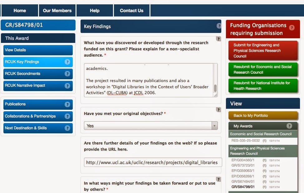
* Entice with inconsistency. See the order of the buttons for each of several grants (left). Every set is different. There are only 6 possible permutations of the three links under each grant heading; 5 of them are shown here. It must take a special effort to program the system to be so creative. Seriously: what does this inconsistency say about the software engineering of the system?
 
* Add enticing unpredictability. Spot the difference between the two screen shots on the right. And then take a guess at what I did to cause that change. It took me several attempts to work it out myself.

I started out trying to make this blog post light-hearted, maybe even amusing. But these problems are just scratching the surface of a system that is fundamentally unusable. Ultimately I find it really depressing that such systems are being developed and shipped in the 21st Century. What will it take to get the fundamentals of software engineering and user experience embedded in systems development?

Wednesday 8 October 2014

Three steps to developing a successful app

This comment is based on studies of healthcare apps, and some recent conversations I've had, but I'm guessing it applies more widely:
  1. Consider what the 'added value' of the app is intended to be. 'Because it's the 21st century' and 'Because everyone uses apps' are not added value. What are the benefits to the user of doing something with an app rather than either doing it some other way or not doing it at all? Make sure there is clear added value.
  2. Consider how people will fit app use into their lives. Is it meant to be used when a particular trigger event happens (e.g., the user is planning to go for a run, or isn't feeling well today), or regularly (after every meal, first thing every morning, or whatever)? How will people remember to use the app when intended? Make sure the app fits people's lives and that any reminders or messages it delivers are timely.
  3. What will people's motivations for using the app be? Are there immediate intrinsic rewards or longer term benefits? Will these be apparent to users? Does there need to be an extrinsic reward, such as competing against others or gaining 'points' of some kind, or might this be counter-productive? Are there de-motivators (such as poor usability)? Make sure the app taps in to people's motivations and doesn't put obstacles in the way of people realising the envisaged rewards.
A fourth important point is to recognise that every person is different: different lifestyle, different motivations, different on many other dimensions. So there almost certainly isn't a "one size fits all" app that everyone will love and engage with. But good and appropriate design will work for at least some people.

Tuesday 12 August 2014

What's the value of human factors?

I was recently in a meeting where a technologist was reporting on a situation where a team had developed a new technology to support work in a clinical setting, but when they tried to deploy it they discovered that people didn't work in the way they had expected. From a user-centred design perspective, this is Rookie Error Number 1: so basic that it is amazing that it still happens so frequently.

It was the next statement that caught me slightly off-guard: that they should have consulted the clinicians ahead of time. Yes, of course they should. But actually, that's probably not enough either. Because clinicians (like all of us) have limited understanding of, or ability to articulate, their own work. The speaker's implicit assumption was clearly that we are all fully capable of describing our work to others in the detail that they would need to be able to design to support that work. That leaves me, as a Human Factors specialist without a job!

Which of course led me to reflect on what my role in such a situation is. What is it that I, or any other HCI / Human Factors specialist brings to the situation that the clinician or the technologist doesn't? In the case of the technologist (or at least, of the technologists who feature in this story), it's a limited understanding of what we're able to articulate, or even know, about our own activities: an assumption that if you ask someone a direct question they will give you a full, frank and accurate answer. In the case of the clinician, like anyone, it's a partial understanding of their own work practices and of how to describe them to a third party.

Many moons ago, Gordon Rugg and I wrote about this in the context of eliciting people's implicit knowledge of their own work, and I'm going to paraphrase some of our own writing:
In terms of understanding what people can articulate about their work, there are three main kinds of knowledge:
  • explicit knowledge (knowledge which is readily available to introspection, and that people can readily articulate);
  • semi-tacit knowledge (knowledge that can be accessed by some techniques but not by others); and
  • tacit knowledge (knowledge which is not accessible to introspection via any elicitation technique). 
There are various types of semi-tacit knowledge, including taken-for-granted knowledge (that is so familiar to the speaker that they will not think to mention it); front and back versions (the official version of what should happen and a more realistic account of what actually happens); and knowledge that depends on recognition rather than recall
Tacit knowledge is subdivided into compiled skills (which have become so habitualised as to be inaccessible to introspection) and implicit learning (knowledge that is tacit throughout, never having been articulated).
So there I have at least a partial answer to my existential angst: that as a Human Factors specialist, I have knowledge of how to elicit semi-tacit knowledge about people's work – and specifically about that work for the purposes of designing technology to support it. So both the technologist and the clinician have a reason to get me involved. Whew!

Friday 16 May 2014

Let's be pragmatic: one approach to qualitative data analysis

Today, Hanna, one of my MSc students, has been asking interesting questions about doing a qualitative data analysis. Not the theory (there's plenty about that), but the basic practicalities.

I often point people at the Braun & Clarke (2006) paper on thematic analysis: it’s certainly a very good place to start. The Charmaz book on Grounded Theory (GT) is also a great resource about coding and analysis, even if you’re not doing a full GT. And I've written about Semi-Structured Qualitative Studies. For smallish projects (e.g. up to 20 hours of transcripts), computer-based tools such as  Atlas ti, nVivo and Dodoose tend to force the analyst to focus on the tool and on details rather than on themes.

I personally like improvised tools such as coloured pens and lots of notebooks, and/or simple Word files where I can do a first pass of approximate coding (either using the annotation feature or simply in a multi-column table). At that stage, I don’t worry about consistency of codes: I’m just trying to see what’s in the data: what seem to be the common patterns and themes, what are the surprises that might be worth looking at in more detail.

I then do a second pass through all the data looking systematically for the themes that seem most interesting / promising for analysis. At this stage, I usually copy-and-paste relevant chunks of text into a separate document organised according to the themes, without worrying about connections between the themes (just annotating each chunk with which participant it came from so that I don’t completely lose the context for each quotation).

Step 3 is to build a narrative within each of the themes; at this point, I will often realise that there’s other data that also relates to the theme that I hadn’t noticed on the previous passes, so the themes and the narrative get adapted. This requires looking through the data repeatedly, to spot omissions. While doing this, it's really important to look for contradictory evidence, which is generally an indication that the story isn't right: that there are nuances that haven't been captured. Such contradictions force a review of the themes. They may also highlight a need to gather more data to resolve ambiguities.

The fourth step is to develop a meta-narrative that links the themes together into an overall story. At this point, some themes will get ditched; maybe I’ll realise that there’s another theme in the data that should be part of this bigger narrative, so I go back to stage 2, or even stage 1.  Repeat until done!

At some point, you relate the themes to the literature. In some cases, the literature review (or a theory) will have guided all the data gathering and analysis. In other cases, you get to stage 4, realise that someone has already written exactly that paper, utter a few expletives, and review what alternative narratives there might be in your data that are equally well founded but more novel. Usually, it’s somewhere between these extremes.

This sounds ad-hoc, but done properly it’s both exploratory and systematic, and doesn’t have to be constrained by the features of a particular tool.

Tuesday 8 April 2014

A mutual failure of discovery: DIB and DiCoT

Today, I have been doing literature searching for a paper on Distributed Cognition (DCog). By following a chain of references, I happened upon a paper on Determining Information Flow Breakdown (DIB). DIB is a method for applying the theory of DCog in a semi-structured way in complex settings. The example the authors use in the paper comes from healthcare.

The authors state that "distributed cognition is a theoretical approach without an accepted analytical method; there is no single 'correct way' of using it. [...] the DIB method is a practical application of the theory." At the time that work was published (2007), there were at least two other published methods for applying DCog: the Resources Model (2000) and DiCoT (Distributed Cognition for Teamwork; 2006). The developers of DIB were clearly unaware of this previous work. Conversely, it has taken me seven years from when the DIB paper was published to become aware of it and my team have been working on DCog in healthcare for most of that time. How could that happen?

I can think of several answers involving parallel universes, different literatures, too many different journals to keep track of, the fragility of search terms, needles in haystacks. You take your pick.

Whatever the answer actually is (and it's probably something to do with a needle in another universe), it's close to being anti-serendipity: a connection that is obvious and should have been expected. We clearly have some way to go in developing information discovery tools that work well.

Saturday 5 April 2014

Never mind the research, feel the governance

In the past 5 days, I have received and responded to:
  • 16 emails from people in the university, the REC and the hospital about one NHS ethics application that required a two-word change to one information sheet after it had already been approved by both the university and the REC - but the hospital spotted a minor problem and now it has to go around the whole cycle again, which is likely to take several weeks at least.
  • 6 emails about who exactly should sign one of the forms in a second ethics application (someone in the university or the hospital).
  • 12 emails about the set of documents (I lost count of what's needed past 20 items) needed for a third application.
I dread to think what the invisible costs of all these communications and actions are, when scaled up to all the people involved in the process (and my part is a small one because I delegate most of the work to others), and to all the ethics applications that are going on in parallel.

I thought I was getting to grips with the ethics system for the NHS; I had even thought that it was getting simpler, clearer and more rational over time. But recent experiences show otherwise. This is partly because we're working with a wider range of hospitals than previously, and every one seems to have its own local procedures and requirements. Some people are wonderful and really helpful; others seem to consider it to be their job to find every possible weakness and block progress. I have wondered at times whether this is because we are not NHS employees (or indeed even trained clinicians). But it seems not: clinical colleagues report similar problems; in fact, they've put a cost on the delays that they have experienced through the ethical clearance process. Those costs run into hundreds of thousands of pounds. We don't do research to waste money like this, but to improve the quality and safety of patient care.

Today, there's an article in the Guardian about the under-resourcing of the health service and the impact this is having on patient care. Maybe I'm naive, but if the inefficiencies that we find in the process of gaining permission to conduct a research study in the NHS are replicated in all other aspects of health service delivery, it's no wonder they feel under-resourced.

Tuesday 1 April 2014

Looking for the keys under the lamp post? Are we addressing the right problems?

Recently, I received an impassioned email from a colleague: "you want to improve the usability of the bloody bloody infusion pump I am connected to? give it castors and a centre of gravity so I can take it to the toilet and to get a cup of coffee with ease". Along with photos to illustrate the point.

He's completely right: these are (or should be) important design considerations. People still want to live their lives and have independence as far as possible, and that's surely in the interests of staff as well as patients and their visitors.

In this particular case, better design solutions have been proposed and developed. But I've never seen one of these in use. I've seen plenty of other improvised solutions such as the bed-bound patient being wheeled from one ward to another with a nurse walking alongside holding up the bag of fluid while the pump is balanced on the bed with the patient.

Why don't hospitals invest in better solutions? I don't know. Presumably because the problem is invisible to the people who make purchasing decisions, because staff and patients are accustomed to making do with the available equipment, and because better equipment costs more but has minimal direct effect on patient outcomes.

An implication of the original message is that in CHI+MED we're addressing the wrong problem: that in doing research on interaction design we're missing the in-your-face problem that the IV pole is so poorly designed. That we're like the drunk looking for the keys under the lamp post because that's where the light is, when in fact the keys got dropped somewhere else. Others who claim that the main problem in patient safety is infection control are making the same point: we're focusing our attention in the wrong place.

I wish there were only one problem to solve – one key to be found, under the lamp post or elsewhere. But that's not the case. In fact, in healthcare there are so many lost keys that they can be sought and found all over the place. Excuse me while I go and look for some more...


Thursday 27 March 2014

Mind the gap: the gulfs between idealised and real practice

I've given several talks and written short articles about the gap between idealised and real practice in the use of medical devices. But to date I've blurred the distinctions between concerns from a development perspective and those from a procurement and use perspective.

Developers have to make assumptions about how their devices will be used, and to design and test (and build safety cases, etc.) on that basis. Their obligation (and challenge) is to make the assumptions as accurate as possible for their target market segment. And to make the assumptions as explicit as possible, particularly for subsequent purchasing and use. This is easier said than done: I write as someone who signed an agreement on Tuesday to do a pile of work on our car, most of which was required but part of which was not; how the unnecessary work got onto the job sheet I do not know, but because I'd signed for it, I had to pay for it. Ouch! If I can accidentally sign for a little bit of unnecessary work on the car, how much easier is it for a purchasing officer to sign off for unnecessary features, or slightly inappropriate features, on a medical device? [Rhetorical question.]

Developers have to work for generic market segments, whether those are defined by the technological infrastructure within which the device sits, the contexts and purposes for which the device will be used, the level of training of its users, or all of the above. One device probably can't address all needs, however desirable 'consistency' might be.

In contrast, a device in use has to fit a particular infrastructure, context, purpose, user capability... So there are many knowns where previously there were unknowns. And maybe the device fits well, and maybe it doesn't. And if it doesn't, then something needs to change. Maybe it was the wrong device (and needs to be replaced or modified); maybe it's the infrastructure or context that needs to be changed; maybe the users need to be trained differently / better.

When there are gaps (i.e., when technology doesn't fit properly), people find workarounds. We are so ingenious! Some of the workarounds are mostly positive (such as appropriating a tool to do something it wasn't designed for, but for which it serves perfectly well); some introduce real vulnerabilities into the system (by violating safety features to achieve a short-term goal). When gaps aren't even recognised, we can't even think about them or how to design to bridge them. We need to be alert to the gaps between design and use.

Sunday 16 March 2014

Collaborative sensemaking under uncertainty: clinicians and patients

I've been discussing a couple of 'conceptual change' projects with clinicians, both of them in topic areas (pain management and contraception) where the clinical details aren't necessarily well understood, even by most clinicians. I have been struck by a few points that seem to me to be important when considering the design of new technologies to support people in managing their health:
  1. Different people have different basic conceptual structures onto which they 'hang' their understanding. The most obvious differences are between health professionals (who have received formal training in the subject) and lay people (who have not), but there are also many individual differences. In the education literature, particularly building on the work of Vygotsky, we find ideas of the 'Zone of Proximal Development' and of 'scaffolding'. The key point is that people build on their existing understanding, and ideas that are too far from that understanding, or are expressed in unfamiliar terms, cannot be assimilated. In the sensemaking literature, Klein discusses this in terms of 'frames', while Pirolli, Card and Russell discuss the process of making sense of new information in terms of how people look for and integrate new information with existing understanding guided by the knowledge gaps of which they are aware. In all of these literatures, and others, it's clear that any individual starts from their current understanding and builds on it, and that significant conceptual change (throwing out existing ideas and effectively starting again from scratch) is difficult. This makes it particularly challenging to design new technologies that support sensemaking because it's necessary to understand where someone is starting from in order to design systems that support changing understanding.
  2. One of the important roles of clinicians is to help people to make sense of their own health. In the usual consultation, this is a negotiative process, in which common ground is achieved – e.g., by the clinician having a repertoire of ways of assessing the patient's current understanding and building on it. The clinician's skills in this context are not well understood, as a far as I'm aware.
  3. For many patients, the most important understanding is 'what to do about it': it's not to get the depth of understanding that the clinician has, but to know how to manage their condition and to make appropriately informed decisions. Designing systems to support people in obtaining different depths and types of understanding is an exciting challenge.
  4. Health conditions can be understood at many different levels of abstraction (from basic chemistry and biology through to high-level causal relations), and we seem to employ metaphors and analogies to understand complex processes. Inevitably, these have great value, but also break down when pushed too far. There's probably great potential in exploring the use of different metaphors and explanations to support people in managing their health.
  5. As people are being expected to take more responsibility for their own health, there's a greater onus on clinicians to support patients' understanding. Clinicians may have particular understanding that they want to get across to patients, but it needs to be communicated in different ways for different people. And we need to find ways of managing the uncertainty that still surrounds much understanding of health (e.g. risks and side-effects).
All these points make it essential to consider Human Factors in the design of technologies to support conceptual change, behavioural change and decision making in healthcare, so that we can close the gap between clinicians' and patients' understanding in ways that work well for both.