Showing posts with label physical-digital. Show all posts

Saturday, 4 April 2020

Extraordinary times (week 3)

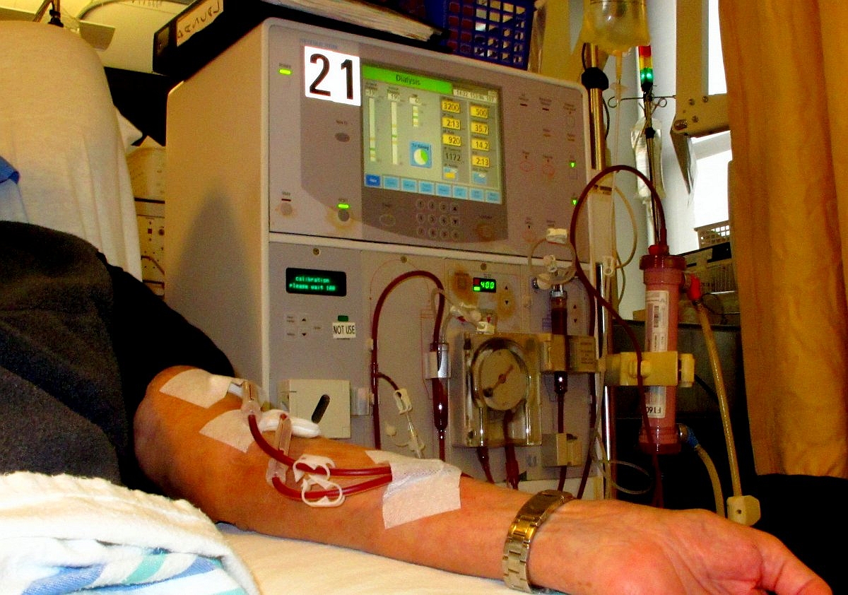
I suspect that this might be my last blog post on the lockdown, unless (or until) something catastrophic happens to family, friends or myself. Things feel as if they are settling into a new routine. [Postscript: a post about April mostly features my Mum being in hospital.]

We are keeping in touch with family and friends a little-and-often: quantity compensating to some extent for lower quality (I really, really miss hugs). I particularly miss outings with my mum (who has dementia): it's hard to keep an online conversation going for long with someone who has little memory and is persistently singing "Yankee Doodle" or "London Bridge" at the other end, whereas it was relatively easy to chatter about things in the environment on an outing.

As I noted last week, online Pilates works pretty well. Zumba is more challenging, but also more fun: who says you can't dance badly in your own living room? I haven't found an adequate online or home-based substitute for climbing. We're lucky that there are lots of footpaths and lanes near our home; we're exploring places we've never discovered before within a mile of home. The spring flowers are looking lovely, and bluebells will be out soon.

With no more university teaching for a while, it's been more meetings than classes. An online PhD viva worked surprisingly well, though I think it was more stressful for everyone than a normal face-to-face one (and that's stressful enough!). I'm learning to schedule gaps between meetings, and also a lunch-break, because these now have to be scheduled. Face-to-face, comfort breaks can be negotiated informally in-the-moment, but that's much harder to do online. Basically, working from home is more intense, particularly when it's back-to-back meetings. And particularly when those meetings involve rethinking all the plans we had for the next several months (no face-to-face interviews, no observational research...).

It still seems very surreal, knowing that the current situation is really challenging and distressing for many while it's actually just a bit weird for us. But it seems like a "new normal", at least for a while.

Saturday, 28 March 2020

Extraordinary times (week 2)

I already noted key experiences from the first week of enforced working from home. At that time, we could still go out. This week, it has been lockdown, with just one walk a day and essential trips (mostly food shopping). The weather has been bright (if a little chilly) all week so it has felt surreal: everything feels fine, almost like a staycation, and yet things are so much more difficult for many other people:
  • the healthcare professionals (including paramedics, porters, cleaning staff, teachers of key workers' children...) who are keeping the healthcare system functioning and putting themselves at risk for all of us.
  • the people delivering essential services (including food, refuse collection, internet and more) so that it can feel like a working staycation for those of us working from home.
  • people who find themselves in isolation or separated from loved ones or stuck in the wrong country as borders closed.
  • people whose income has dried up, whose businesses are threatened, who aren't sure how they will pay the bills.
  • parents now managing home schooling on top of everything else, and/or people supporting eldery relatives who are living independently.
  • and of course people who are having to deal with the worst of Covid-19, experiencing the loss of family or friends or feeling like they have been "hit by a train" (can't remember who described it like that) themselves.
So it seems like the best way to apply my skills is to maintain "business as usual" for the students and colleagues I work with. And to stay at home to do that. In many ways it has been a mundane week.

Monday's teaching was challenging. The topic was "global healthcare" – I could not have anticipated quite how we would be viewing this topic when I planned it six months ago. I could record the lecture ahead of time, but I really wanted the students, particularly those who had experience of other healthcare systems, to share their insights. But with over 30 students joining remotely, some with very dodgy internet connections, it was impossible to involve them all, even though I'd included a "google slides" document for people to contribute key points. It all got particularly stressful when my own connection got flaky and kept dropping the audio channel. About three weeks ago, I lost my voice (laryngitis) in class, and now my internet connection was delivering virtual laryngitis. And I still haven't worked out how to make group discussions work well with 30+ participants spread around the world.

We did our first sessions of remote yoga and Pilates at home.  All furniture pushed to one side.It worked amazingly well, probably helped by the fact that we knew the teachers and most of the moves pretty well already.

On Tuesday, I had my first remote teaching session with the grandsons. The older one was keen to learn; the younger was just tired. Kahoot! quizzes were great, though I've found that creating ones tailored to the children are better than using other people's quizzes. When I invited them to do and show me a drawing it was challenging to see it, particularly since they weren't sure where the camera was at their end. But we can learn and get better. This week, the themes will be rainbows, light and eyes.

On Wednesday, I chatted with my mum over facetime. She was out in the garden, enjoying the sunshine, and seemed happy. But the sun shining on the screen meant that she couldn't really see me, so it was more like a phone call than video. I remain relieved that she is in good hands.

On Thursday, I was teaching a smaller group who all seemed to have reasonable internet connections. We shared photos and sketches of multimodal interactions in our homes, from ovens and toasters to toothpaste tubes (since we couldn't access a surgical simulator, which was the original plan), and it worked really well. I'm still not sure what the surgical equivalent of toothpaste is, but I'm sure there must be one.

That evening was the first online Zumba class. This didn't work as well as the Pilates because the Zumba experience depends more on the sense of other people around one, and also requires more space, but it was still lovely to dance like no-one's watching. Which they weren't (since I had to turn the video off to maintain the internet connection).

So it seems that people who are afflicted by Covid19 are reliant on the health service while those of us who are fortunately well so far are reliant on our internet service providers. Plus food and loo rolls. Thank you to all!

There's a short update about week 3. Things are becoming normalised until there's a major change...

Monday, 23 March 2020

Extraordinary times

Two weeks ago (Monday 9th March), I stood at the front of a class and said "In the unlikely event that UCL closes before the end of term..." and within a week all face-to-face teaching had been cancelled. Such is the experience of exponential change. I know I'm not alone in realising that views I held a matter of days ago were untenable. I am guessing that this process of revising beliefs and attitudes isn't over yet.

The last day I was in the office was just two days after that wildly incorrect assessment. I'd planned to work at home the end of that week anyway. Since I work at home quite often I was already set up for most things, but there were a few items I hadn't brought home. The most critical turned out to be my interoperable collection of "so 1990s" Filofaxes. I ordered one. I've lost continuity in my note taking, but by asking all my team to remind me what we'd agreed in our previous meetings I'm catching up quickly. Home delivery worked brilliantly too.

Improvised desks are sprouting up in our house, such as a standing desk made up of an old bookshelf with a small "laptop desk" which is located right next to the wifi router for use during the more critical online meetings.

I had to do a rapid rethink on all my teaching: lectures got recorded ahead of time so that I wasn't totally reliant on our home broadband at the critical time (that worked easily once I'd mastered the uploading software for the virtual learning environment). Class quizzes worked well remotely. Class discussion with over 30 students was challenging. When I had a smaller class a few days later, I mercilessly brought each student into the discussion, keeping a list of who had contributed and who hadn't yet. Not as good as face-to-face, but not bad either.

This coming week, I'd have liked to do a discussion exercise with digital postits in class. I considered several alternative tools for this; some required too much set-up for a single session; some work better asynchronously than in real time; I've ended up just sharing an online document that all students can contribute to, and we'll see whether we can build a discussion around that. It's all a bit of an adventure.

Many of our MSc students are having to rethink their projects for this summer because we have to assume they won't be able to travel or to do any collocated data collection. That's yet another challenge. But at least we can all access library resources from our homes because of all the work that has been done to make them remotely accessible.

I seem to be spending most working hours in online meetings. Many of these work as well as traditional meetings. More importantly, we're using the same videoconferencing technologies for social events: for sitting around in the evenings with friends and family – not just one-to-one like phone calls, but collecting in groups, socially close while physically distant.

None of this would have been possible, even a few years ago. Even if the foundations of the Internet were established in the 1960s and the early World Wide Web around 1990, the tools that we're now using on top of these structures have all been developed within the past few years. And they are getting easier to use and to fit into our lives very rapidly.

If SARS-COV2 had emerged three years ago, I don't know how we would have dealt with ageing parents who believed that they could live independently but actually needed a lot of support (to which they were unrelentingly hostile). Since then, my father has died and my mother is now in a care home, living with advanced dementia. I wouldn't want to visit (even if permitted) for fear of passing on COVID-19 to the wonderful residents or staff. So last week we tried using FaceTime to chat (with support from Jo the manager). I wasn't hopeful that Mum would engage at all, but she seemed to recognise me (at least as a close female relative, if not necessarily as her daughter). We had a good few minutes' surreal chat interspersed with Mum singing then, as I made to say goodbye, she leant forward and kissed the phone. It was strange, and yet poignantly lovely to have this kind of connection when we can't be together. Even if both the phone and Mum's lips then needed a clean!

On Friday, we had a take-away. It seems important to support our local restaurants as they are forced to close and take-aways are the only option. I wonder whether it will continue to be a safe option at all in the coming weeks.

Schools closed on Friday (20th March), which is going to add to the stresses of our children continuing to work while also home schooling. Family have been recruited as remote teachers. Granny will be doing reading and writing; Grandad is starting with some "horrible history"; Auntie will be teaching French; and I'm concocting some science lessons. If we thought remote teaching of students was challenging, remote teaching of small boys ia likely to be substantially more so, but at least it will mean regular contact, and we'll all learn something new in the process.

There are also lots of online classes sprouting up: I'm looking forward to yoga and zumba this week even if they will require us to reorganise furniture even more (in addition to the improvised desks) to make space to move.

We know we are really lucky: we can work fairly effectively from home and we have a garden for fresh air. Mum is safe and well looked after; the rest of the family are all well so far, even if the youngsters are restless. We are aware that many other people have much greater challenges and stresses and grief to deal with. I am truly grateful to all key workers: in healthcare and in keeping essential services (including food, medication and internet provision!) available.

Footnote: Week 2 was still a period of adjustment...

Monday, 25 June 2018

Happy 70th birthday (to digital and to the NHS)!

It's been widely publicised that it's the 70th birthday of the NHS on 5th July this year. When preparing to be interviewed for a Telegraph podcast on digital health, I realised that it's also the 70th birthday of the "Manchester Baby", the first stored program computer (21st June). So in a very real sense, the parentage of digital health in the UK was born 70 years ago. There are other relevant birthdays to celebrate too, such as the 60th of the Human Factors Journal (for which usable health technology is an important theme) and the 500th of the Royal College of Physicians.

Manchester baby head onWe've come such a long way in 70 years. Many of the major advances in that time can be attributed to a better understanding of hygiene and antibiotics, and to pharmaceuticals more generally. As advances in pharma are becoming more costly, digitally enabled health and wellbeing are likely to provide greater gains.

The history of analogue medical devices goes back hundreds, or even thousands, of years. For example surgical knives are believed to date from Mesolithic times (8000BC), syringes from the 1500s, and the first stethoscope from 1816.  

There have been transformational developments in digital health technologies from the 1970s onwards. People may find it difficult to remember back to the times when there was no such thing as intensive care (as we now understand it) but it has emerged within our lifetimes: critical care medicine, with its focus on continuous monitoring and intervention, was established in the late 1950s. Imaging is another area that has grown in significance from x-rays – largely since the 1970s, when Computerised Tomography (CT scans) and Magnetic Resonance Imaging (MRI) were introduced. Now computing is fast enough that it is becoming possible to use imaging in real time during surgery, and to introduce interactive 3D images (built up from 2D slices).
 
These are part of another phase of rapid developments which are also being brought about by the availability of consumer devices, including wearables, that are becoming accurate enough to substitute for professional devices. Also, big data; for example, genomics is improving our understanding of the interrelationships between genes and their combined influence on health, while consumer genetic testing kits are making new health-relevant information available to the individual.

As the digital computer and the NHS reach their 70th birthdays, we are seeing huge advances in the technologies that address relatively simple problems. However, we have made much less progress in the technologies for complex problems. Go into any hospital and look at the complexity of the systems clinicians have to use – e.g. 20-30 different interactive technologies on a general ward, all with different user interfaces, all of which every nurse is expected to be able to use. From a patient perspective, someone managing multiple health conditions has to integrate information between the different tools and specialisms they have to engage with. We are seeing growing friction as what is theoretically possible slips past what is currently practicable.
 
What do the next 70 years promise? It is of course hard to say. A paperless NHS? – probably not by 2020, but maybe by 2088. Patient controlled electronic health records? – maybe if people are appropriately educated and supported in managing the burden of care; this will require us to address health inequalities brought about by differentials in income, education, technology literacy, health literacy, etc. The huge challenge is not the technology, but the individual and social factors, and the regulations, around it. This will require a new approach to data privacy and security, funding models and regulations that are fit for the 21st century, and education for clinicians, technologists and the public to ensure these changes are beneficial for all.
 
Of course, the NHS is just one healthcare delivery organization, amongst many globally. Some other health providers are doing things on a shoestring but overtaking the West in many ways by being agile – e.g., investing straight in mobile technology.
 
However, whatever advances we see in technology, care is still first and foremost about the human touch. The technology is there to support people.

Monday, 31 August 2015

The Digital Doctor


I’ve just finished reading The DigitalDoctor by Robert Wachter. It’s published this year, and gives great insight into the US developments in electronic health records, particularly over the past few years: Meaningful Use and the rise of EPIC. The book manages to steer a great course between being personal (about Wachter’s career and the experiences of people around him) and drawing out general themes, albeit from a US perspective. I’d love to see an equivalent book about the UK, but suspect there would be no-one qualified to write it.

The book is simultaneously fantastic and slightly frustrating. I'll deal with the frustrating first: although Wachter claims that a lot of the book is about usability (and indeed there are engaging and powerful examples of poor usability that have resulted in untoward incidents), he seems unaware that there’s an entire discipline devoted to understanding human factors and usability, and that people with that expertise could contribute to the debate: my frustration is not with Wachter, but with the fact that human factors is apparently still so invisible, and there still seems to be an assumption that the only qualification that is needed to be an expert in human factors is to be a human.

The core example (the overdose of a teenage patient with 38.5 times the intended dose of a common antibiotic) is told compellingly from the perspectives of several of the protagonists:

    poor interface design leads to the doctor specifying the dose in mg, but the system defaulting to mg/kg and therefore multiplying the intended dose by the weight of the patient;

    the system issues so many indistinguishable alerts (most very minor) that the staff become habituated to cancelling them without much thought – and one of the reasons for so many alerts is the EHR supplier covering themselves against liability for error;

    the pharmacist who checked the order was overloaded and multitasking, using an overly complicated interface, and trusted the doctor;

    the robot that issued the medication had no ‘common sense’ and did not query the order;

    the nurse who administered the medication was new and didn’t have anyone more senior to quickly check the prescription with, so assumed that all the earlier checks would have caught any error, so the order must be correct;

    the patient was expecting a lot of medication, so didn’t query how much “a lot” ought to be.
This is about design and culture. There is surprisingly little about safer design from the outset (it’s hardly as if “alert fatigue” is a new phenomenon, or as if the user interface design and confusability of units is surprising or new): while those involved in deploying new technology in healthcare should be able to learn from their own mistakes, there’s surely also room for learning from the mistakes (and the expertise!) of others.

The book covers a lot of other territory: from the potential for big data analytics to transform healthcare to the changing role of the patient (and the evolving clinician–patient relationship) and the cultural context within which all the changes are taking place. I hope that Wachter’s concluding optimism is well founded. It’s going to be a long, hard road from here to there that will require a significant cultural shift in healthcare, and across society. This book really brought home to me some of the limitations of “user centred design” in a world that is trying to achieve such transformational change in such a short period of time, with everyone having to just muddle through. This book should be read by everyone involved in the procurement and deployment of new electronic health record systems, and by their patients too... and of course by healthcare policy makers: we can all learn from the successes and struggles of the US health system.

Saturday, 27 December 2014

Positive usability: the digital and the physical

I complain quite a lot about poor usability: for example, of ResearchFish and electronic health records, so it's good to be able to celebrate good usability (or at least good user experience) too.

Last week, my car gained a puncture. On a Sunday. Not a good experience. But sorting out was as painless as I can imagine: it was quick to find a mobile tyre replacement service (etyres, in case anyone else suffers a similar fate), to identify a suitable tyre amongst a very large number of options and to fix a fitting time. All online (apart from the actual fitting, of course), and all clear and simple. It just worked.

I've had analogous experiences with some home deliveries recently: rather than the company leaving a note to say that they tried to deliver the parcel and it has been returned to the depot, and I can pick it up at my convenience (sigh!), they have notified me that it's ready and asked me to choose a delivery time that suits. All online; all easy.

Of course, neither tyre selection and fitting nor parcel delivery is as complex a task as data management of complex records. But it's delightful when the service is designed so that the digital and the physical fit together seamlessly, and digital technologies really deliver something better than could be achieved previously.

Friday, 6 September 2013

The look of the thing matters

Today, I was at a meeting. One of the speakers suggested that the details of the way information is displayed in an information visualisation doesn't matter. I beg to differ.

The food at lunchtime was partly finger-food and partly fork-food. Inevitably, I was talking with someone whilst serving myself, but my attention was drawn to the buffet when a simple expectation was violated. The forks looked like this:

 ...so I expected them to be weighty and solid. But the one I picked up felt like this:

– i.e., insubstantial and plastic. The metallic look and the form gave an appearance that didn't match reality.

I remember a similar feeling of being slightly cheated when I first received a circular letter (from a charity) where the address was printed directly onto the envelope using a handwriting-like font and with a "proper" stamp (queen's head and all that). Even though I didn't recognise the handwriting, I immediately expected a personal letter inside – maybe an invitation to a wedding or a party. But no: an invitation to make a donation to the charity. That's not exciting.

The visual appearance of such objects introduces a dissonance between expectation and fact, forcing us to shift from type 1 (fast, intuitive) thinking to type 2 (slow, deliberate) thinking. As the fork example shows, it's possible to create this kind of dissonance in the natural (non-digital) world. But it's much, much easier in the digital world to deliberately or accidentally create false expectations. I'm sure I'm not the only person to feel cheated when this happens.

Tuesday, 13 August 2013

Wizard of Oz: the medium and the message

Last week, one of my colleagues asserted that it didn't matter how a message was communicated – that the medium and the message were independent. I raised a quizzical eyebrow. A few days previously, I'd been in Vancouver, and had visited the Museum of Anthropology. It's a delightful place: some amazing art and artefacts from many different cultures. Most of them relate to ceremony and celebration, rather than everyday life, but they give a flavour of people's cultures, beliefs and practices. And most of them are beautiful.

One object that caught my attention was a yakantakw, or "speaking through post". According to the accompanying description: "A carved figure such as this one, with its prominent, open mouth, was used during winter ceremonies. A person who held the privilege of speaking on behalf of the hosts would conceal himself behind the figure, projecting his voice forward. It was as though the ancestor himself was calling to the assembled guests." This particular speaking through post dates from 1860, predating the Wizard of Oz by about 40 years.

In HCI, we talk about "Wizard of Oz experiments" in which participants are intended to believe that they are interacting with a computer system when in fact they are interacting with a human being who is hiding behind that system. It matters that people think that they are interacting with a computer rather than another human being. The analogy with the Wizard of Oz is quite obvious. But is looks like the native people in that region beat L. Frank Baum to the idea, and we should really be calling them "Yakantakw experiments". Just as soon as soon as we Western people learn to pronounce that word.

Saturday, 22 June 2013

Time management tools that work (or not)

Today, I missed a lunch with friends. Oops! What happened?

My computer died (beyond repair) a couple of months ago, so I got a new one. Rather that trying to reconstruct my previous way of working, I chose to start again "from scratch", though of course that built a lot on previous practices. One of the changes I introduced was that I separated my work and leisure diaries: work is now recorded in the University Standard Diary (aka Outlook) so that managers and administrators can access my diary as needed; leisure is recorded in Google Calendar (which is what I used to use for everything).

But in practice, there's only one of me, and I only live one life. And most of my 'appointments' are work-related. So I forgot to keep looking in the leisure diary. Hence overlooking today's lunch with friends, which had been in the diary for at least six months. Because it had been in the diary for so long it wasn't "in my head". Doh!

When I was younger, life seemed simpler: if it was Monday -Friday, 9-5 (approx) then it was work time; else it was leisure time. Except holidays. Keep two diaries, one for work and one for leisure. Easy. But the boundaries between work and leisure have blurred. Personal technologies travel to work; work technologies come home; work-time and home-time have poorly defined boundaries. It's hard to keep the plans and schedules separate. But I, like most people, don't particularly want work colleagues to know the minutiae of my personal life. Yes, the work diary allows one to mark entries as "private", but:
1) that suggests that it's a "private" work event, and
2) an entry in a "work" diary is not accessible to my family, although I'd like them to be able to refer to my home diary.

The ontology of my diary is messed up: I want work colleagues to be able to access my work diary and family to be able to access my leisure diary, but actually at the heart of things I want to be able to manage my life, which isn't neatly separated into work and leisure.

Saturday, 18 May 2013

Coping with complexity in home hemodialysis

We've just had a paper published on how people who need to do hemodialysis at home manage the activity. Well done to Atish, the lead author.

People doing home hemodialysis are a small proportion of the people who need hemodialysis overall: the majority have to travel to a specialist unit for their care. Those doing home care have to take responsibility for a complex care regime. In this paper, we focus on how people use time as a resource to help with managing care. Strategies include planning to perform actions at particular times (so that time acts as a cue to perform an action); allowing extra time to deal with any problems that might arise; building in time for reflection into a plan (to minimise the risks of forgetting steps); and organising tasks to minimise the number of things that need to be thought about or done at any one time (minimising peak complexity). There is a tendency to think about complex activities in terms of task sequences, and to ignore the details of the time frame in which people carry out tasks, and how time (and our experience of time) can be used as a resource as well as, conversely, placing demands on us (e.g. through deadlines).

This study focused on particular (complex and safety-critical) activity that has to be performed repeatedly (every day or two) by people who may not be clinicians but who become experts in the task. We all do frequent tasks, whether that's preparing a meal or getting ready to go to work, that involve time management. There's great value in regarding time as a resource, to be used effectively, as well as it placing demands on us (not enough time...)

Friday, 26 April 2013

Who's the boss? Time for a software update...

Last summer, I gave a lift to a couple of friends to a place I was unfamiliar with. So I used a SatNav to help with the navigation. It was, of course, completely socially unaware. It interrupted our conversation repeatedly, without any consideration for when it is and is not appropriate to interrupt. No waiting for pauses in the conversation. No sensitivity to the importance of the message it was imparting. No apology. Standard SatNav behaviour. And indeed it’s not obvious how one would design it any other way. We turned off the sound and relied solely on the visual guidance after a while.

More recently, a colleague started up his computer near the end of a meeting, and it went into a cycle of displays: don’t turn me off; downloading one of thirty three. I took a record of the beginning of this interaction, but gave up and left way before the downloading had finished.
It might have been fine to pull the plug on the downloading (who knows?) but it wasn’t going to be a graceful exit. The technology seemed to be saying: “You’ve got to wait for me. I am in control here.” Presumably, the design was acceptable for a desktop machine that could just be left to complete the task, but it wasn’t for a portable computer that had to be closed up to be taken from the meeting room.

I have many more examples, and I am sure that every reader does too, of situations where the design of technology is inappropriate because the technology is unaware of the social context in which it is placed, and the development team have been unwilling or unable to make the technology better fit that context.

Friday, 15 February 2013

The information journey and information ecosystems

Last year, I wrote a short piece for "Designing the search experience". But I didn't write it short enough (!) so it got edited down to a much more focused piece on serendipity. Which I won't reproduce here for copyright reasons (no, I don't get any royalties!). The theme that got cut was on information ecosystems: the recognition that people are encountering and working with information resources across multiple modalities the whole time. And that well designed information resources exploit that, rather than being stand-alone material. OK, so this blog is just digital, but it draws on and refers out to other information resources when relevant!

Here is the text from the cutting room floor...

The information journey presents an abstract view of information interaction from an individual’s perspective. We first developed this framework during work studying patients’ information seeking; the most important point that emerged from that study was the need for validation and interpretation. Finding information is not enough: people also need to be able to assess the reliability of the information (validation) and relate it to their personal situation and needs (interpretation).

This need for validation and interpretation had not been central to earlier information seeking models—possibly because earlier studies had not worked with user groups (such as patients) with limited domain knowledge, nor focused on the context surrounding information seeking. But we discerned these validation and interpretation steps in all of our studies: patients, journalists, lawyers and researchers alike.

The information journey starts when an individual either identifies a need (a gap in knowledge) or encounters information that addresses a latent need or interest. Once a need has been identified, a way to address that need must be determined and acted upon, such as asking the person at the next desk, going to a library, looking “in the world,” or accessing internet resources. On the web, that typically means searching, browsing, and follow trails of “information scent”. Often finding information involves several different resources and activities. These varied sources create an information ecosystem of digital, physical and social resources.

Information encountered during this journey needs to be validated and interpreted. Validation is often a loose assessment of the credibility of the information. Sillence and colleagues highlight important stages in the process: an early and rapid assessment—based on criteria such as the website’s design and whether it appears to be an advertising site—is typically followed by a more deliberate analysis of the information content, such as assessing whether it is consistent with other sources of information.
 
Interpretation is not usually straightforward. It often involves support from information intermediaries (an important part of the information ecosystem). This is one of the important roles of domain specialists (e.g. doctors and lawyers): working with lay people to interpret the “facts” in the context of the actual, situated needs. Even without help from intermediaries, Sillence & co. describe the lay users of health information in their study as acting like scientists, generating and testing hypotheses as they encountered new information resources, both online and offline. No one information resource is sufficient: online information fits in a broader ecology of information sources which are used together, albeit informally, to establish confidence and build understanding.
 
The interpretation of information can often highlight further gaps in understanding. So one information need often leads to others. For example, a colleague of mine was recently planning to buy a Bluetooth headset. His initial assumption was that there were only a few suitable headsets on the market, and his aim was simply to identify the cheapest; but it quickly became apparent that there were hundreds of possible headsets, and that he first needed to understand more about their technical specifications and performance characteristics to choose one that suited his needs. A simple information problem had turned into a complex, multi-faceted one. A known item search had turned into an exploratory search, and the activity had turned from fact-finding to sensemaking.

Information resources surround us. We are informavores, consuming and interpreting information across a range of channels. We are participants in huge information ecosystems, and new information interaction technologies need to be designed not just to work well on their own, but to be valuable components of those ecosystems.

Thursday, 17 January 2013

When context really matters: entertainment, safety ... or neither?

Yesterday, Mark Handley drew my attention to a video of the recent evacuation of an All Nippon Airways Boeing 787 due to a battery problem: "Here's a video from inside the plane:  The inflight entertainment system has clearly just rebooted, and about half the screens are displaying the message "Please Wait" in large comforting letters. Maybe not the most appropriate message when you want people to evacuate quickly!"

Fortunately, it seems that passengers ignored the message asking them to wait, and did indeed evacuate instead. But did they do so as quickly as they might have done otherwise? We'll never know. They will have had many other sources of information available at the time, of which the most powerful were probably other people's behaviour and the appearance of the evacuation slides. The digital and physical contexts were providing different cues to action.

Brad Karp observed that : "Presumably when you activate the slides, you either want to kill the entertainment system or have it display "EVACUATE!"

Alan Cooper, in "The inmates are running the asylum", discusses many examples of interaction design. One he explores is the challenge of designing good in-flight entertainment systems. For example, he points out that the computer scientist's tendency to deal with only three numbers (0, 1, infinity) is inappropriate when choosing a maximum number of films to make available on a flight, and that choosing a reasonable (finite) number makes possible attractive interaction options that don't scale well to infinity. He also argues that the entertainment system needs two different interfaces: one for the passenger and a different one for the crew who need to manage it. But if you watch the video, you will see that half the screens on the plane are showing a reboot sequence. Who designed this as an interface for passengers? If the system developers don't even think to replace a basic reboot sequence by something more engaging or informative, what chance of them thinking about the bigger picture of how the entertainment system might be situated within, and interact with, the broader avionics system?

In-flight entertainment systems don't seem to be considered as part of the safety system of the aircraft. Surely, they should be. But that requires a broader "systems" perspective when designing, to give passengers more contextually relevant information that situates the digital more appropriately within the physical context.

Happy (entertaining, safe) flying!

Wednesday, 9 January 2013

Sometimes it just works!

Last week, we were in Spain, enjoying the sunshine and using the motorways. And I was really impressed by their toll machines: attractive, easy to use, and even delightful. Even though they were taking our money. My very amateur video of the machine in action isn't great (sorry!), but it shows the key features of the system.


1) The instructions screen presents a clear representation of what to do next, independent of language. This isn't essential, but provides backup for those who might not be able to interpret the main interface.

2) Each action is clearly illuminated in a timely way: insert ticket; pay (card, notes / coins); get change; optionally, get receipt. Sure, the action sequence is simple, and there's limited scope for error, but the device leaves little room for doubt. [Contrast this with the story a colleague told me of observing someone buying a ticket from a UK rail ticket machine who could not locate a notes slot, so folded up a £5 note and fed it carefully into the coin slot.]

3) The coin slot, in particular, is well designed, opening and closing smoothly to accept coins at just the right time.

I know it's simple, but that's surely the point: it's only as complicated as it needs to be, and no more, and it's easy even for someone who speaks no Spanish to use without help.

Human–Computer Interaction specialists like me tend to notice poor features of interactive systems; it's delightful to celebrate a system that really seems to work well, come rain or shine.

Tuesday, 13 November 2012

It was a dark and stormy night... accounting for the physical when designing the digital

Yesterday, I used the London cycle hire scheme for the first time. I had checked all the instructions on how to hire a bike online before heading off to the nearest cycle station, all prepared with my cycle helmet and my payment card. For various reasons, it was dark and drizzling by the time I got there. The cycle station display was well illuminated, so I could go through the early stages of the transaction without difficulty, but then it came to inserting the payment card. Ah. No illumination. No nearby streetlight to improve visibility. I found myself feeling all over the front of the machine to locate the slot… which turned out to be angled upwards rather than being horizontal like most payment card slots. I eventually managed to orient the card correctly in the dark and get it into the reader.

Several steps of interaction later, the display informed me that the transaction had been successful, and that my cycle release code was being printed. Nothing happened. Apparently, the machine had run out of paper. Without paper, there is no release code, and so no way of actually getting a cycle from the racks.

To cut a long story short, it took over 30 minutes, and inserting my payment card into four different cycle station machines distributed around Bloomsbury, before I finally got a printed release code and could take a bicycle for a spin. By then it was too late to embark on the planned errand, but at least I got a cycle ride in the rain...

The developers have clearly thought through the design well in many ways. But subtleties of the ways the physical and the digital work together have been overlooked. Why is there no illumination (whether from street lighting or built into the cycle station) for the payment card slot or the printout slot? Why is there apparently no mechanism for the machine to detect that it is out of paper before the aspiring cyclist starts the interaction? Or to display the release code on-screen to make the system more resilient to paper failure? Such nuanced aspects of the situated use of the technology in practice (in the dark and the rain) have clearly been overlooked. It should be a universal design heuristic: if you have a technology that may be used outdoors, check that it all works when it's cold, dark and damp. Especially in cold, dark damp cities.

Tuesday, 23 October 2012

Information detours

Recently, I did an online transaction. It started out superficially simple: to buy rail tickets from London to Salford. But then I had to check on a map of Salford to find out which station was appropriate. And the train operator wanted to know my loyalty card number, so I had to go and get that from my purse. Then my credit card supplier wanted me to add in additional security information, which of course I don't remember, so I had work to reconstruct what it might be. A superficially simple task had turned into a complicated one with lots of subtasks that comprise "invisible work".

It's a repeating pattern: that information tasks that are, at first sight, simple turn out to involve lots of detours like this, and sometimes the detours are longer than the original task.

Occasionally the detours are predictable; for example, I know that to complete my tax return I'm going to have to dig out a year's worth of records of income and expenditure that are filed in different places (some physical, some digital). There aren't actually a large number of relevant records, but I still dread this data collation task, which is why the relatively simple task of completing the form always gets put off until the last minute.

It's both hard to keep track of where one is amongst all these information detours and hard to keep focused on the main task through all the detours and distractions of our rich information environments. I'd like a supply of digital place-keeping widgets to help with progress-tracking amongst the clutter. If they could also link seamlessly to physical information resources, that would be even better...

Sunday, 2 September 2012

Situated interaction from the system perspective: oops!

I am in Tokyo, to give a talk at Information Seeking In Context. Blogger infers that because a post is being composed in Tokyo, the author must understand Kanji. Result:

I have just experimented by pressing random buttons to enlarge the screen shot above from its default illegible size. It is quite gratifying to discover that it is still possible to compose a post, add a link, add a graphic, and maybe even publish it as intended. But believe me: it's taking a lot of effort. I am interacting with what appear to me to be squiggles (though of course those squiggles have meaning for readers of Kanji), and I can only guess the meaning from the graphical layout and positioning of the squiggles.

This is an amusing illustration of the dangers of computing technology being inappropriately "situated". The system has responded to the "place" aspect of the context while not adequately accounting for the "user" aspect. I fully accept that the physical environment presents information to me in Kanji, and that I sometimes fail to interpret it correctly. I don't expect the digital environment to put the same hurdles in my way!

Monday, 7 May 2012

Usable security and the total customer experience

Last week, I had a problem with my online Santander account. This isn't particularly about that company, but a reflection on a multi-channel interactive experience and the nature of evidence. When I phoned to sort out the problem, I was asked a series of security questions that were essentially "trivia" questions about the account that could only be answered accurately by being logged in at the time. I'd been expecting a different kind of security question (mother's maiden name and the like), so didn't have the required details to hand. Every question I couldn't answer made my security rating worse, and quite quickly I was being referred to the fraud department. Except that they would only ring me back within 6 hours, at their convenience, not mine. I never did receive that call because I couldn't stay in for that long. The account got blocked, so now I couldn't get the answers to the security trivia questions even though I knew that would be needed to establish my identity. Total impasse.

After a couple more chicken-and-egg phone calls, I gathered up all the evidence I could muster to prove my identity and went to a branch to resolve the problem face-to-face. I was assured all was fine, and that they had put a note on my account to confirm that I had established my credentials. But I got home and the account was still blocked. So yet another chicken-and-egg phone call, another failed trivia test. Someone would call me back about it. Again, they called when I was out. Their refusal to adapt to the customer's context and constraints was costing them time and money, just as it was costing me time and stress.

I have learned a lot from the experience; for example, enter these conversations with every possible factoid of information at your fingertips; expect to be treated like a fraudster rather than a customer... The telephone interaction with a human being is not necessarily any more flexible than the interaction with an online system; the customer still has to conform to an interaction style determined by the organisation.

Of course, the nature of evidence is different in the digital world from the physical one, where (in this particular instance) credible photo ID is still regarded as the Gold Standard, but being able to answer account trivia seems like a pretty poor way of establishing identity. As discussed last week, evidence has to answer the question (in this case: is the caller the legitimate customer?). A trivia quiz is not usable by the average customer until they have learned to think like security people. This difference in thinking styles has been recognised for many years now (see for example "Users are not the enemy"); we talk about interactive system design being "user centred", but it is helpful if organisations can be user centred too, and this doesn't have to compromise security, if done well. I wonder how long it will take large companies to learn?

Sunday, 26 February 2012

Ordering wine: the physical, the digital and the social

For a family birthday recently, we went to Inamo. This is not a restaurant review, but reflections on an interactive experience.

Instead of physical menus and a physical waiter, each of us had a personal interactive area on the tabletop that we used to send our individual order to the kitchen and do various other things. In some ways this was great fun (we could have "tablecloth wars" in which we kept changing the decor on the table, or play games such as Battleships across the table).

In other ways it was quite dysfunctional. For example, we had to explicitly negotiate about who was going to order bottles of water and wine because otherwise we'd have ended up with either none or 5 bottles. In most restaurants, you'd hear whether it's been ordered yet or not, so you know how to behave when it's your turn to order. But it's more subtle than that: whereas with physical menus people tend to hold them up so that they are still "in the space" with their party, with the tabletop menus people were heads-down and more engrossed in ordering from the menu than the company, and there was no external cue (the arrival of the waiter) to synchronise ordering. So the shift from the physical to the digital meant that some activities that used to be seamless have now become seamful and error-prone. The human-human coordination that is invisible (or seamless) in the physical world has to be made explicit and coordinated in the digital. Conversely, the digital design creates new possibilities that it would be difficult to replicate in the physical implementation.

There is a widespread belief that you can take a physical activity and implement a digital solution that is, in all respects, the same or better. Not so: there are almost always trade-offs.